EyeEm News - Notification Design
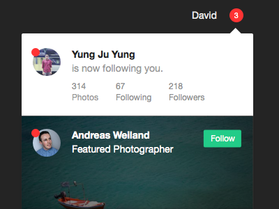
Hey folks, here we've been working on a new notification design, aiming to reduce the usual clutter and create more diversity in the notification feed.
This shot features an example to highlight several news items and add a visual weight to the most important news cards. I feel like adding this visual cards gives the whole feed more diversity, as you always stumble upon things that look and feel different than the rest.
Several concepts for example went in this direction:
1. New Followers shown with social stats, giving a quick preview if a followers profile is worth checking out. More social stats lead to more interest.
2. Removing the timestamp on each news card and aggregating news based on time (today, yesterday, etc.) helps to remove clutter and focus user attention on prominent CTAs (Follow, join, read, etc.)


