Logo Design for Blue Jay Bookkeeping

When Cindy at Blue Jay Bookkeeping LLC came to me for a logo redesign, she had a clear vision: Cindy wanted something elegant, professional, and distinctly feminine. A logo that would immediately set her apart from competitors while reinforcing trust, reliability, and expertise.
Her old logo wasn’t necessarily bad but it leaned more toward being decorative rather than strategic. It lacked the modern refinement and brand clarity needed to stand out in an increasingly competitive market where AI-driven bookkeeping services are on the rise.
The goal was to take all of the positive qualities of the old logo (the recognizable “Blue Jay” theme) and refine them into something more professional, versatile, and memorable.
Here’s the break down:
1. Simplification and Versatility
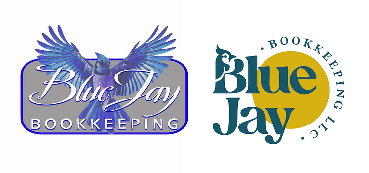
- In the old logo, the bird illustration is highly detailed and photorealistic, which becomes visually busy and loses clarity at smaller sizes (e.g., on business cards or social media avatars).
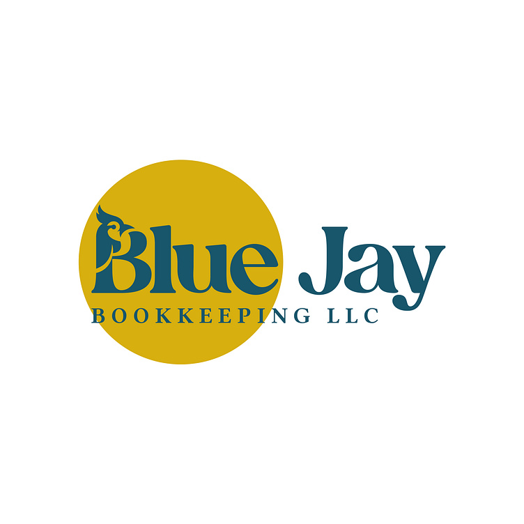
- By moving to a simplified icon, a stylized blue jay silhouette in the letter “B” the design becomes more versatile. It can be used in a variety of contexts (large signage, small digital icons, embroidery, etc.) without sacrificing legibility.
2. Modernized Color Palette
- The old logo relies on a somewhat muted gray background with a bright cobalt blue outline and text. Although it evokes the “Blue Jay” idea, the overall combination can feel a bit dated and one-dimensional.
- In the new design, the dark teal/blue color paired with a bold gold circle feels fresher and more sophisticated. The gold accent adds warmth and contrast, making “Blue Jay” stand out more.
3. Refined Typography
- The script lettering in the original has a traditional flair but can be hard to read quickly, especially when “Blue Jay” is placed over an active bird illustration.
- For the new typeface we wanted to go with something more modern and clean. It’s bolder and easier to read at a glance, giving the brand a stronger presence. The curved, stylized forms also pair neatly with the circular shape in the background.
4. Improved Focus on the Brand Name
- In the old mark, viewers’ eyes are pulled primarily to the large spread of the bird’s wings; the actual words “Blue Jay Bookkeeping” can get lost.
- Our updated layout emphasizes “Blue Jay” first and “Bookkeeping LLC” in a neat, balanced arc. This hierarchy is more effective at communicating the company name right away.
5. Professional Tone
- A photorealistic bird can lean a bit toward illustrative or playful. That might work in some industries, but for a bookkeeping service (where trust, clarity, and professionalism are crucial), a cleaner look often resonates better with clients.
- The updated design’s simpler shapes and calmer color palette convey reliability and modernity, giving a stronger corporate feel without losing the original spirit of the blue jay.
Overall, I think the redesign retains the best parts of the old logo while taking it into a more polished, contemporary space. It’s instantly identifiable, scales down neatly, and better reflects a trusted bookkeeping brand.
Whether you’re starting from scratch or ready to refresh an existing logo, my goal is to guide you through the design process so you stand out in a crowded market. Ready to make a lasting impression? Let’s bring your vision to life!