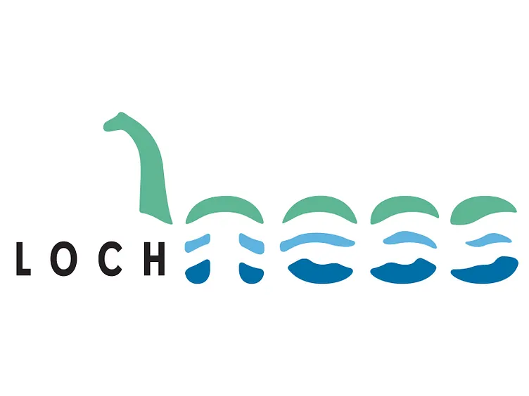
Loch Ness - (Updated version)
UPDATE: After posting the previous version and having time to walk away. I returned to see ways I could improve the logo with less wave lines. This allowed for greater legibility and the nice affect of adding different blue values. So, here's an updated version.
More by Michael Campbell View profile
Like
