Joy Spread
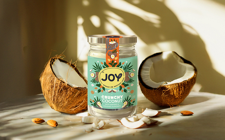

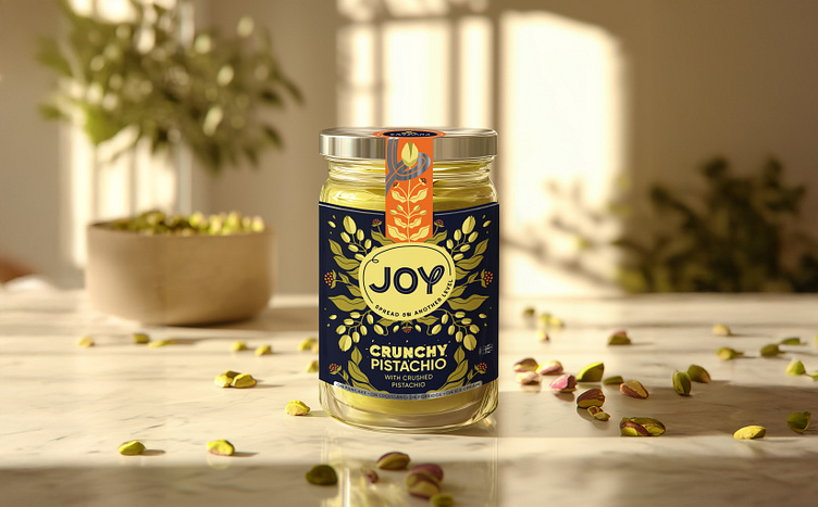
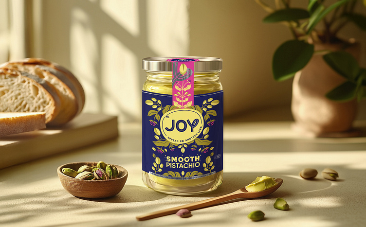
For Joy Spread’s packaging, we fused classic elegance with a fresh, contemporary edge. Drawing inspiration from vintage British tea packaging and William Morris’ intricate mirrored patterns, we crafted unique, symmetrical designs for each flavor. The geometric elements provide a modern touch, while silver foil highlights the premium nature of the brand.
The playful use of color, such as vibrant yellow or pink, ties the collection together, ensuring that each flavor stands out while maintaining cohesive brand identity. The logo redesign builds on the traditional badge style, incorporating a thicker sans-serif font that conveys a fun and approachable tone. By adding a dynamic touch with the extended “y” character and integrating this motif into the supporting graphics, we created a lively brand experience that aligns with the brand’s spirited personality. The result is a refined yet playful visual identity, ensuring Joy Spread’s packaging feels both luxurious and inviting.
Photos © Copyright: Studio Zak
