The Better Chip
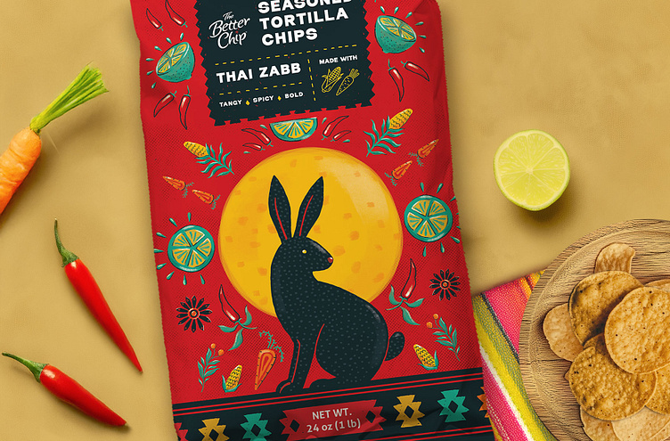
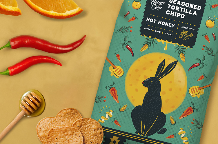
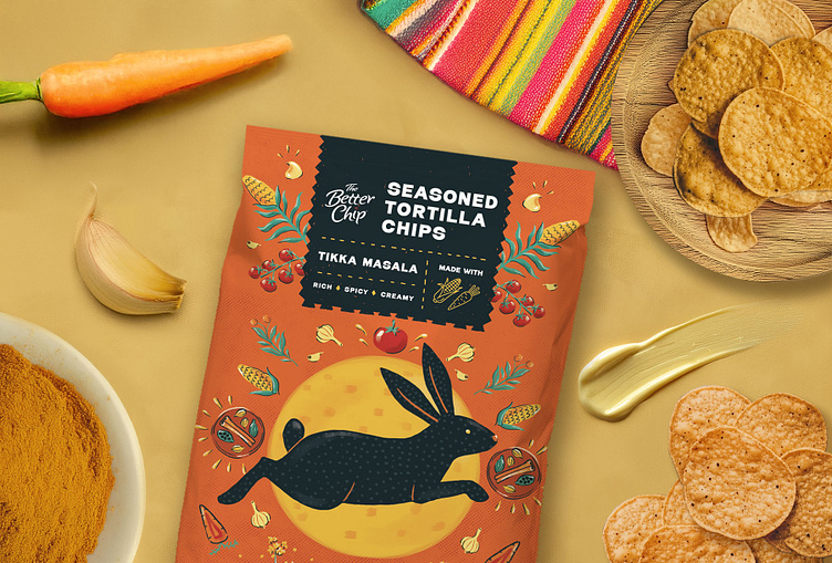
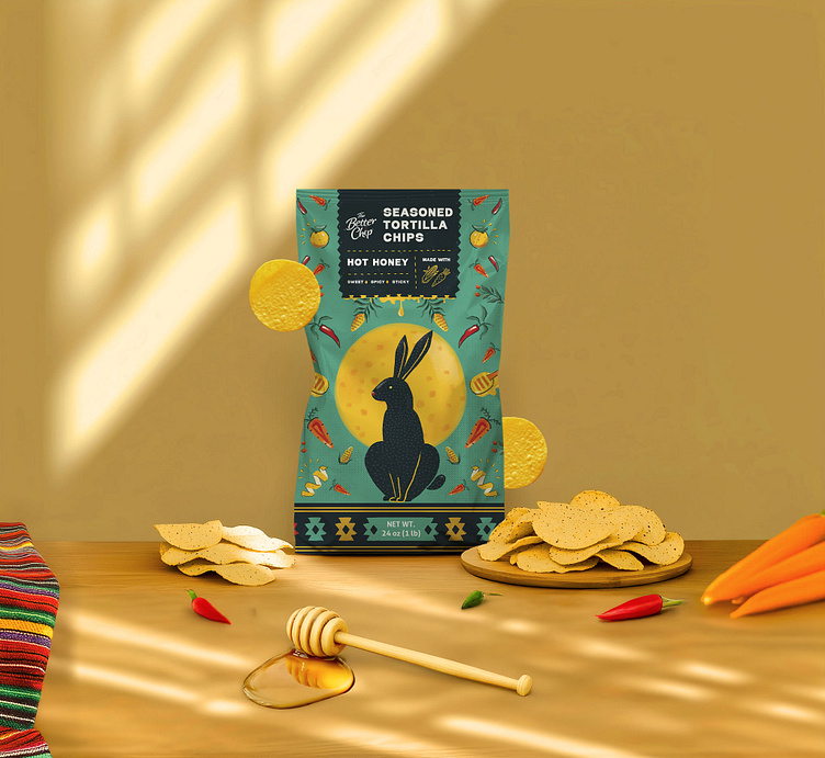
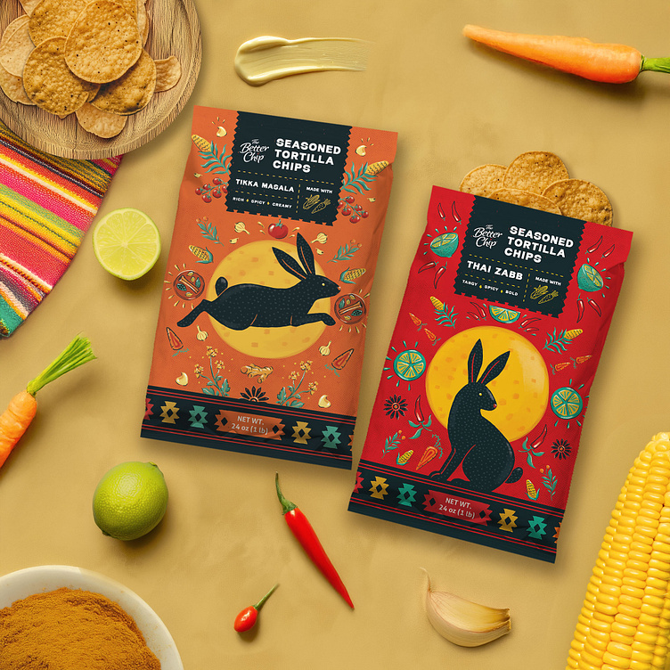
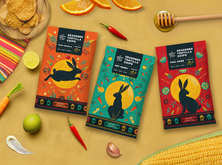
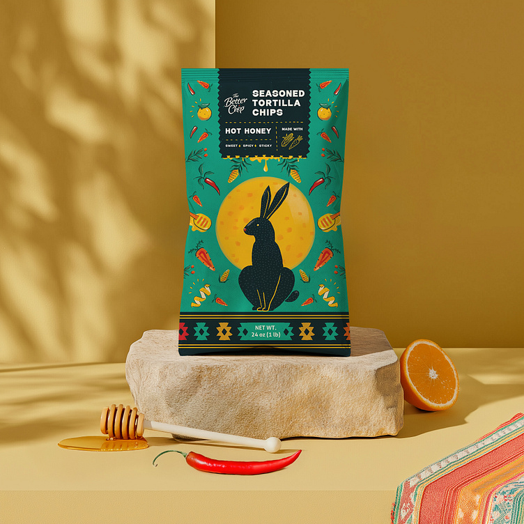
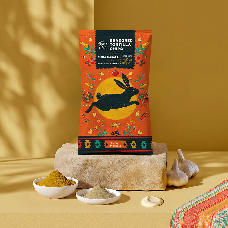
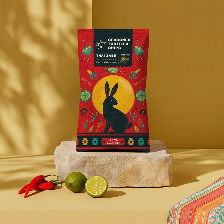
The Better Chip packaging design pays homage to the ancient tale of the Rabbit on the Moon, reimagining the round tortilla chip as the moon itself. According to legend, a kind rabbit offered its food to a starving traveler, who was actually a deity in disguise. Moved by the rabbit’s generosity, the deity honored it by placing its image on the moon.
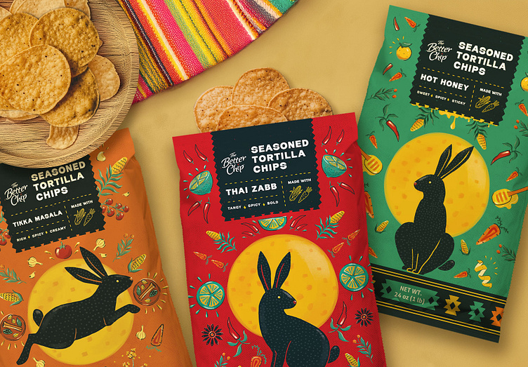
This visual storytelling is woven into the design concept, blending myth with vibrant, traditional Mexican patterns—a nod to the deep-rooted connection between tortillas and Mexican heritage. The mirrored, geometric patterns, inspired by Mexican folk art, feature the rabbit, the moon, and key ingredients like carrots, chilies, and honey, varying by flavor. The result is a bold, eye-catching composition that balances authenticity with modern and playful appeal.
Designed for a club-size, family-style bag, the packaging features a high-contrast color palette, with striking combinations like bright yellow and red or orange and green, ensuring strong shelf impact. A minimalist font provides clarity, allowing the intricate, colorful elements to shine.
Crafted to captivate Gen Z and Millennials, this design blends bold creativity with cultural storytelling, ensuring The Better Chip stands out in the competitive snack aisle.
Photos © Copyright: Studio Zak
