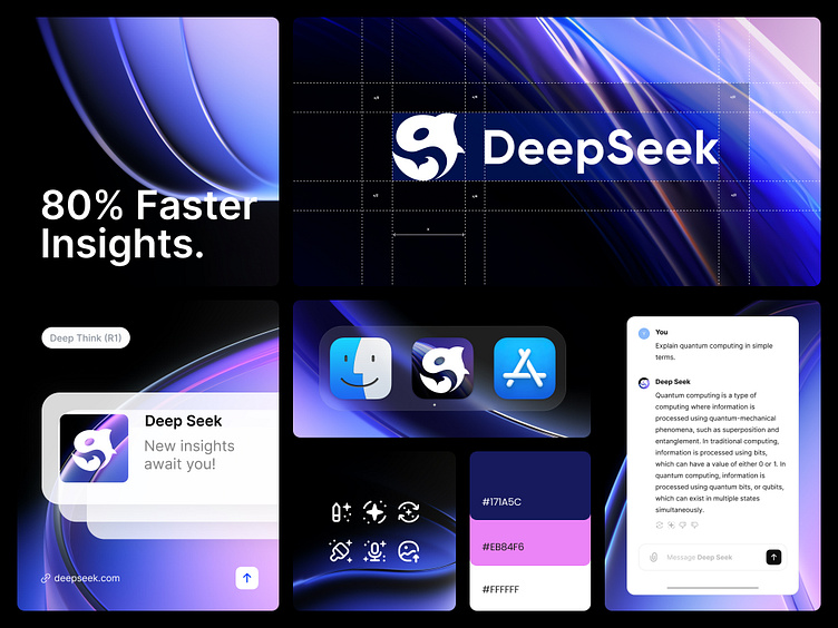
Deep Seek Logo Rebranding
A few days ago, we were introduced to Deep Seek. While I was searching on the internet for the story behind this logo, I couldn't find anything. So, I asked Deep Seek about the meaning behind it, and it replied that it's an abstract mark.
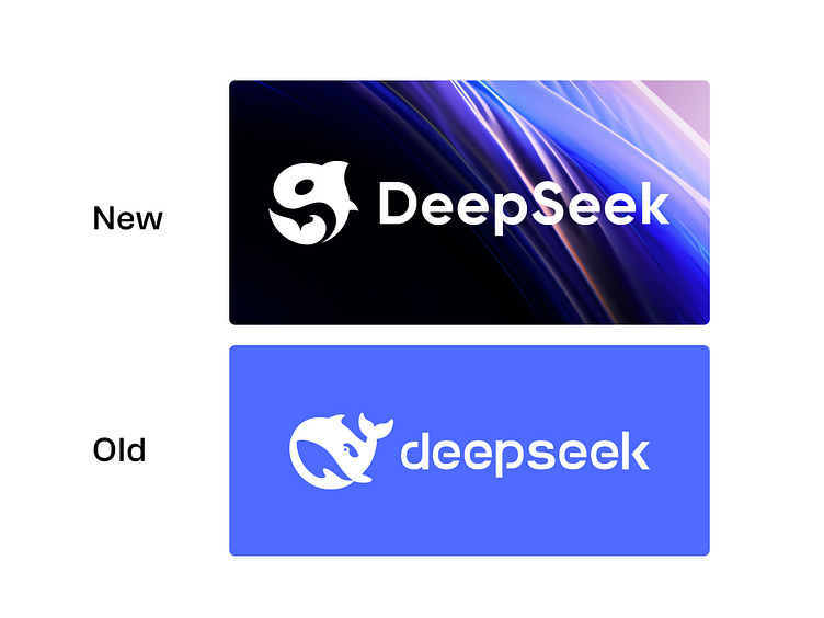
At first glance, I thought it looked like a whale, but When I show the closer the fin on top of the mark, it clearly looks like an orca, a member of the dolphin family, also known as the "killer whale" or "Open AI killer."
The existing logo is not symmetrical and looks unbalanced, especially this bottom part . This drives me to redesign it.
- Shifted away from a playful vibe to something more serious and slick.
- Retained the orca but made it appear aggressive.
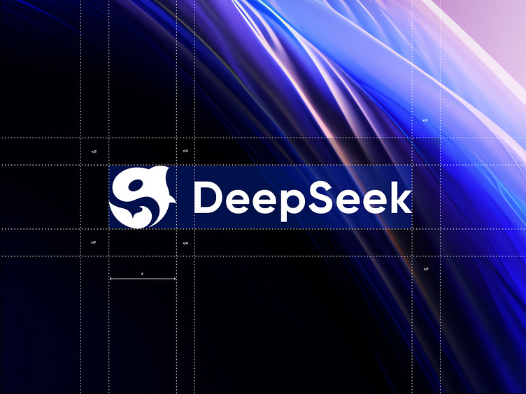
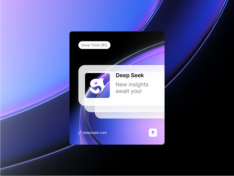
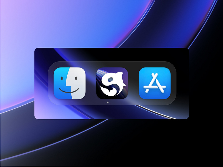
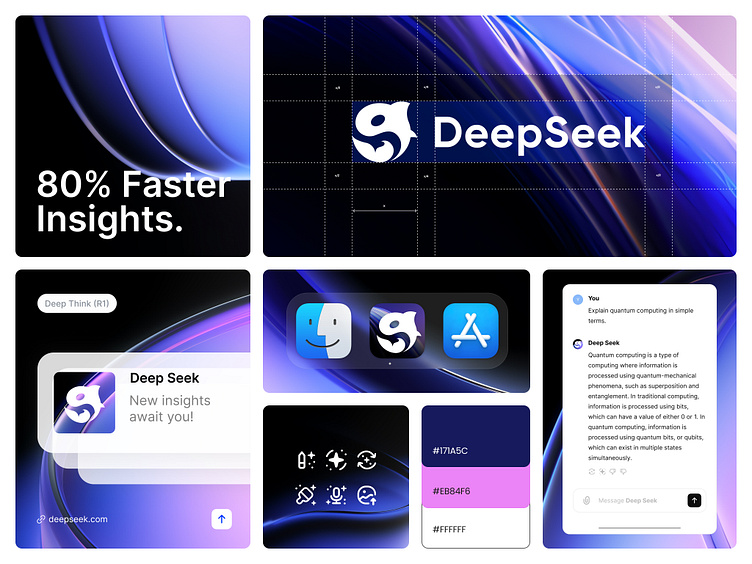
- Opted for a circular shape to ensure it fits well as a favicon or wherever else it's needed.
-I chose a modern, simple font for clarity and memorability in the logo design.
- Also added a vibrant color palate.
What do you think about these changes?
Project Team
Year — 2025
Task — Brand Strategy & Visual Identity
Strategic & Creative Leader — Samin Yesser Nuhas & Firqah Lab
Brand Design — Samin Yesser Nuhas.
Visual Identity — Samin Yesser Nuhas.
Studio — The Design Ventures And Firqah Lab
If you intended to be a client, please join list.
We have the capacity to work with only 20 clients per month.
𝗕𝗲𝗵𝗮𝗻𝗰𝗲 𝗣𝗼𝗿𝘁𝗳𝗼𝗹𝗶𝗼 : https://www.behance.net/samin_dzns
𝗗𝗿𝗶𝗯𝗯𝗯𝗹𝗲 𝗣𝗼𝗿𝘁𝗳𝗼𝗹𝗶𝗼 : ttps://dribbble.com/samin_dzns
𝗙𝗔𝗤 : https://lnkd.in/gK3ZU7j3
Follow us for more cool stuff ✨
https://bento.me/saminyeasernuhas
Would love to hear your feedback! 🚀
All images, artworks in this post are not to be used or distributed without the consent of the designer.
© Samin Yesser Nuhas 2025. All rights reserved.