SoundCloud Redesign - For Fun!
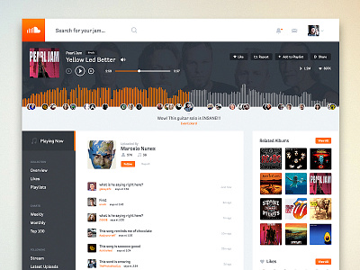
This is a redesign of SoundCloud.com (single track page) purely for fun with some notable changes.
Please checkout the full pixels attached to this shot and the current page for comparison: https://soundcloud.com/marcelonunes-2/pearl-jam-yellow-led-better
The most notable update was to SoundCloud's track player, which is mostly known for it's user comments based on the song timeline/timestamp. Their current global player doesn't include these comments and while less real estate is used, I feel that it takes away some of the most interesting social aspects of SoundCloud.
Also updated to a global sidebar nav so that users can access several hidden navigation items. This project was streamed for an audience LIVE at http://Twitch.tv/Adobe - Most likely some UI/UX decisions that may not work great to due rushed time. (sorry!)
Check out the attachments for full size and some notes.
Please leave a Like if you enjoy this. Thank you!


