🎨 Crafting Delightful Error States UI
Excited to share this UI design I recently created for handling error states in an app. 🚀
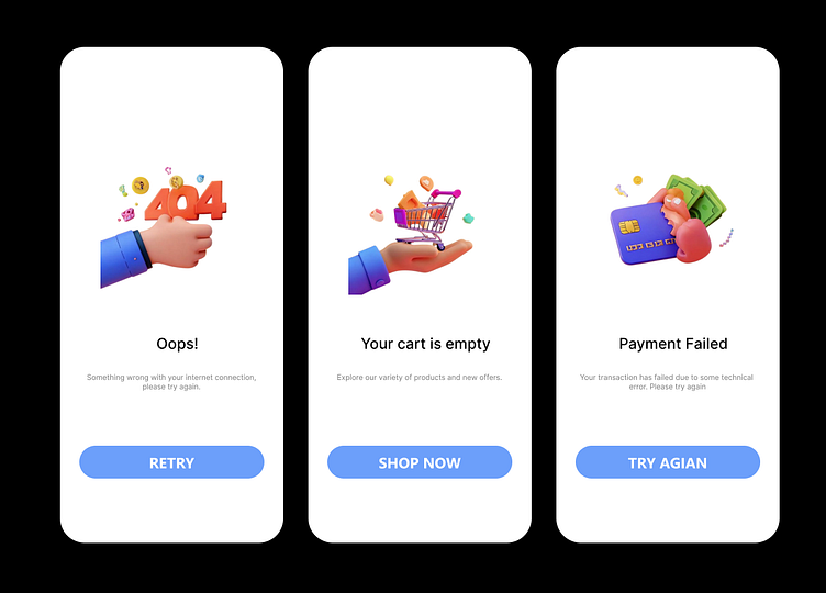
Error screens are often overlooked in design, but they play a crucial role in guiding users and maintaining a positive experience during setbacks.
💡 What makes these designs effective?
1️⃣ Friendly Visuals: Engaging 3D illustrations to ease frustration and humanize error scenarios.
2️⃣ Clear Messaging: Simple, action-oriented text for better user understanding.
404 Error: "Oops! Something wrong with your internet connection. Please try again."
Empty Cart: Encouraging users to explore products: "Your cart is empty. Shop now!"
Payment Failed: Offering actionable feedback to retry the transaction.
3️⃣ Strong CTAs: Bold, easy-to-spot buttons (e.g., Retry, Shop Now) to help users quickly recover.
4️⃣ Consistent Visual Theme: Clean and modern layout with soft colors and whitespace for focus.
🔗 Why it matters: A polished error state can turn a frustrating moment into an opportunity to engage and retain users. It’s about showing empathy and providing clarity when things go wrong.
