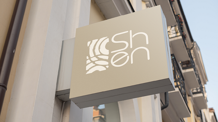
Shen - Branding & Visual Identity
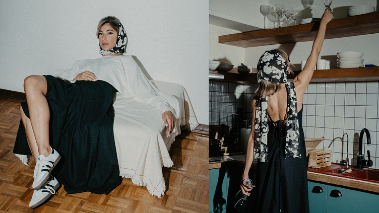
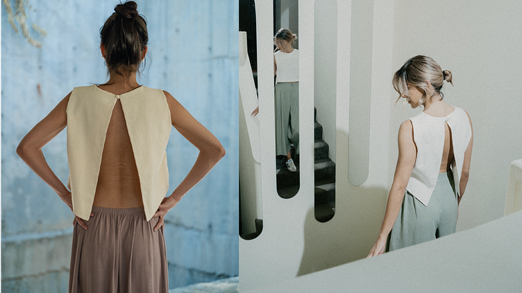
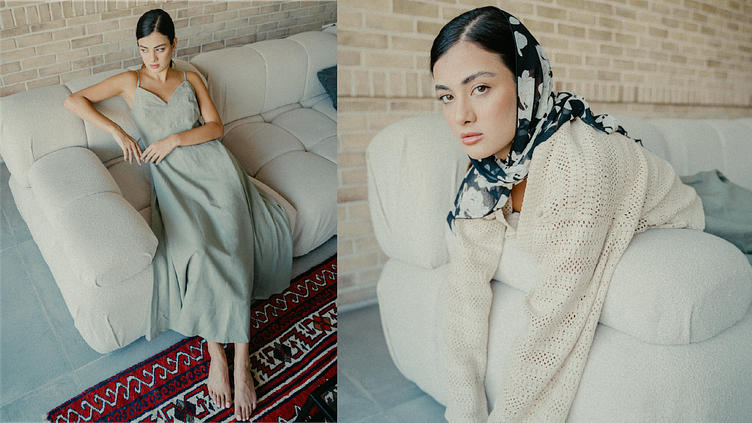
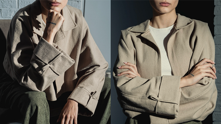
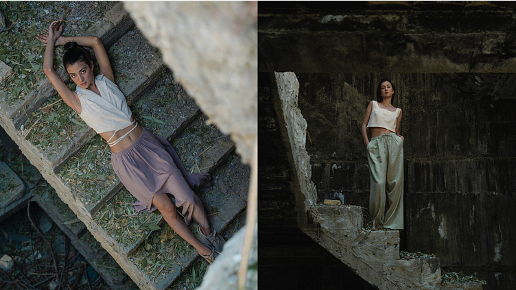
Shen is a unique brand rooted in the beauty of nature, embodying freedom, individuality, and grace. Inspired by the harmony of sand and the timeless philosophy of Zen, Shen reflects simplicity, balance, and cultural depth. Just as footprints in the sand capture moments of presence and calm, Shen’s philosophy is grounded in warmth, authenticity, and boldness.
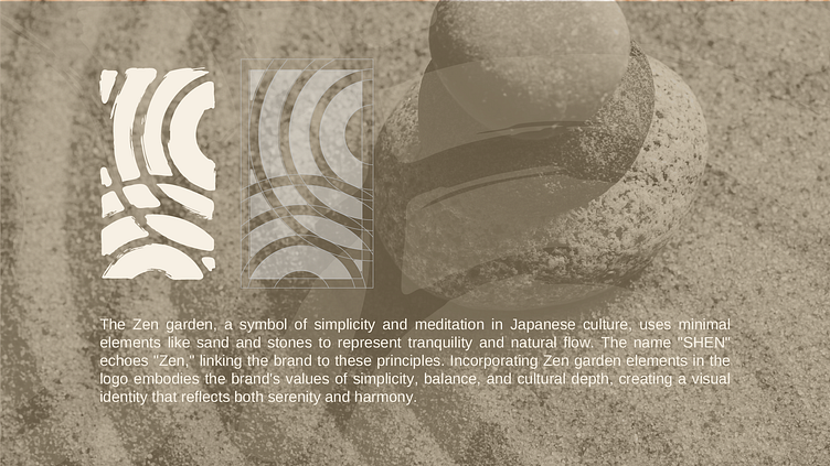
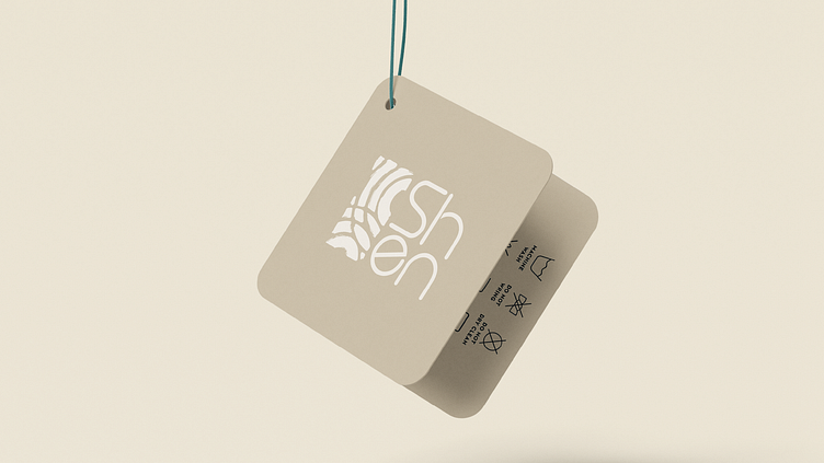
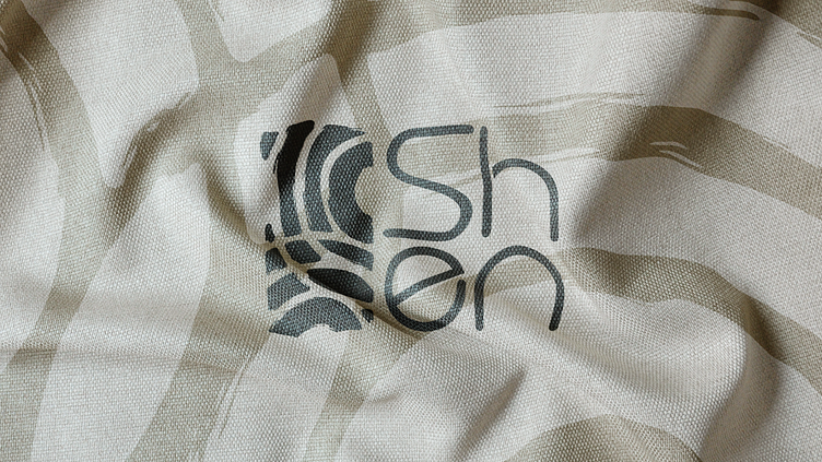
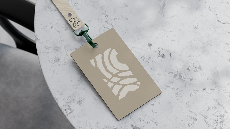
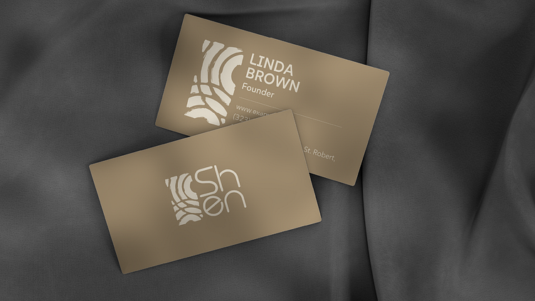
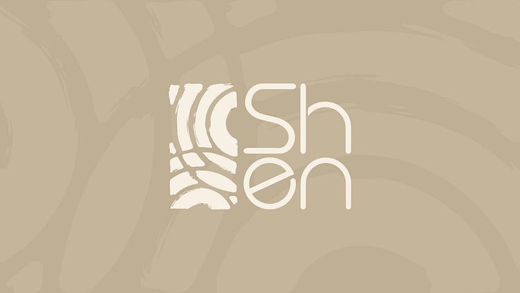
At Garteh, we embraced the essence of Zen and its philosophy to design Shen’s logo mark. Drawing inspiration from Zen gardens—symbols of simplicity and meditation—we created a visual identity that mirrors the serene flow of sand and the harmonious arrangement of stones. Every curve and element of the logo was carefully crafted to reflect Shen’s core values: freedom, purity, beauty, and boldness.
The design process was guided by the Zen principles of balance and mindfulness, resulting in a logo that is both timeless and deeply meaningful. Its organic shapes and minimalist composition embody Shen’s connection to nature while celebrating individuality, much like the unique imprints left by footsteps in the sand.
This collaboration with Shen allowed us to translate their story and philosophy into a visual identity that is as authentic and graceful as the brand itself.
Discover more about our creative journey and the meaning behind Shen’s identity below: