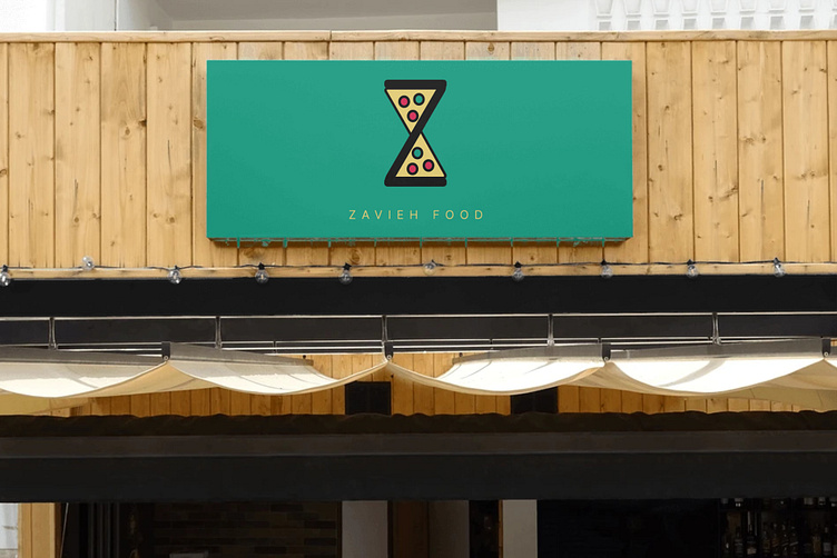
Z food logo design
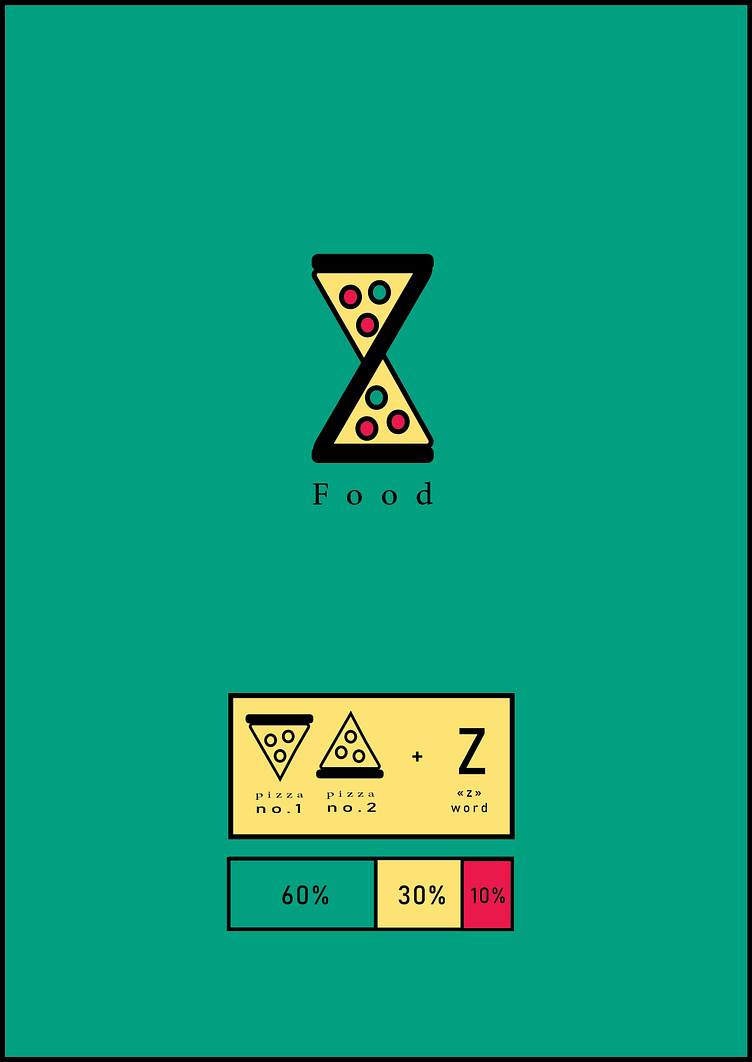
In this project, the most difficult challenge was to avoid the color stereotypes of current fast food (a lot of use of red and orange colors) and that the client wanted the letter Z to be clear at first glance and attract the most attention.
In the design section, an effort was made to ensure that the shapes were in line with the brand concept and that the rounded ends of the lines evoked a friendly feeling.
Finally, I tried to briefly and directly express the concepts of the project in a way that this logo would remain simple in the eyes of the audience.
*** IF YOU LIKE IT dont forget to hit "L" button 👨🦲❤️🔥
*** IF YOU HATE IT dont forget to give me "😒" emoji in comments😂🖤
