Design system
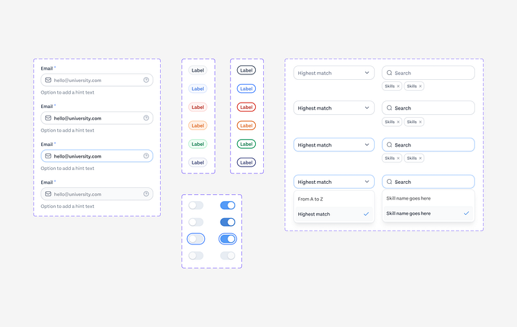
I customized a design system for a web app, applying Atomic Design principles to create a scalable UI component library.
Starting from foundational elements like colors, typography, and spacing, I developed components such as buttons, input fields, dropdowns, and modals, all to meet the app's requirements.
Using Figma’s component properties, I introduced advanced functionality, including destructive states (true/false), dynamic placeholders, labels, helper texts, and contextual icons like tooltips or help icons.
I also defined state-based variants for components, covering hover, focus, error, and disabled states.
For inputs and dropdowns, I incorporated variants for search capabilities, multi-select options, and responsive designs.