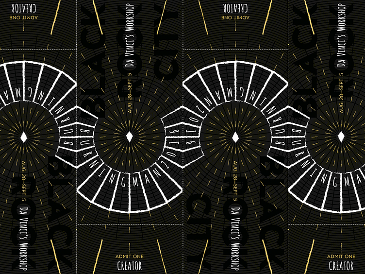
Burning Man 2016 ticket design submission
This was my submission for this year's Burning Man ticket design. It wasn't chosen, so here's a dribbble of it 😉The theme is Da Vinci's Workshop and for me, I was most interested in Leo's work that focused on maps, drafting, proportions and geometry.
There were similarities that stuck out between Da Vinci's Imola Map and the layout of Black Rock City (and Vitruvian Man, though I wanted to avoid referring to it)—most obviously, using a circle and lines to divide and give usable meaning to space. And of course, BRC's layout is in itself a map.
To me, a big part of Burning Man is exploration, and maps represent that too. So, the ticket design explores this map + geometry/symmetry + enlightenment mashup. The yellow in this mock, I envisioned to be gold foiled 😁
