Insurance Company Dashboard UI Design
Enter your text here...Hey Everyone, I’m back! 😎
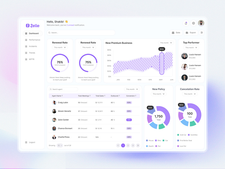
Recently, I’ve been working on an Insurance Company Dashboard UI Design. The goal was to create a solution that simplifies complex insurance data and empowers teams to perform at their best.
Challenges Faced by Insurance Teams:
-Difficulty keeping track of renewal rates and premium business growth in real time.
-A lack of clarity in agent performance metrics and key business trends.
-Complex data visualization making it harder to make quick decisions.
My Solution:
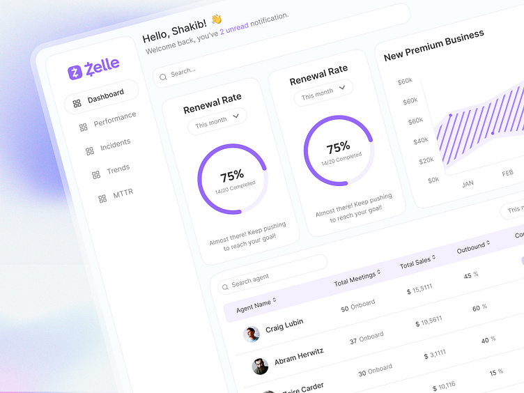
💡 Dashboard Overview: This section provides a clear summary of renewal rates, premium business growth, and key performance indicators in one place.
💡 Agent Performance Tracking: Easily compare team metrics like total meetings, sales, and conversion rates to identify top performers.
💡 Interactive Data Visualization: Real-time graphs, charts, and progress indicators simplify the most important stats.
💡 Customizable Filters: Options to sort by date, export reports, and drill into specific data for deeper insights.
This design focuses on improving decision-making and creating a seamless user experience for insurance teams to stay on top of their goals.
What do you think? Would love your feedback! 👇
I'm ready to help. Contact me now!
Let’s create designs that inspire and deliver results!
Feedback is always welcome. 🙌
✦
📮 shakib1wrk@gmail.com
💬 wa.me/+8801611230152
✦
