Credit Card Checkout UI
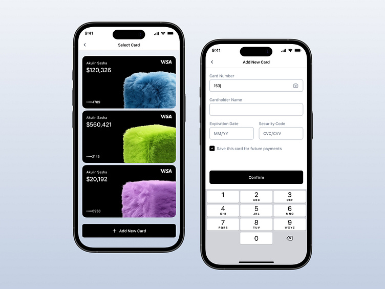
I'm continuing to improve my UI skills with my second project – a credit card selection screen and a form for adding a new card.
I’d like to highlight an important UX detail that is often overlooked – automatic focus on the first input field. This small feature saves users an extra tap and instantly opens the keyboard, speeding up the form-filling process.
However, it's important to consider the context: if the form is complex or requires careful input, auto-focus might be unnecessary. But in cases where the form is simple and intuitive, like in this example, such a micro-improvement makes the user experience much smoother.
