Qloud - Logo Design
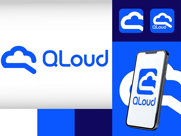
Hello Everyone! 👋 Meet QLoud, a clean and modern brand identity designed for a company specializing in cloud-based solutions.
Why QLoud? ☁️ The logo creatively integrates a cloud and magnifying glass, symbolizing seamless exploration and innovative cloud services. 🎨 A simple yet bold blue and white color palette to evoke trust, reliability, and technological sophistication.
Design Highlights:
Iconic and Memorable Logo: Combines the simplicity of a cloud shape with a unique twist for instant recognition.
Vibrant Color Palette:
#3366FF for a professional and trustworthy vibe.
#1A1A55 for a touch of depth and modernity.
Typography: Rounded and clean, echoing the brand’s modern and user-friendly ethos.
The mockups showcase the logo’s versatility, from app icons to mobile interfaces, highlighting how QLoud fits seamlessly across digital platforms.
What do you think? Hit ❤️ or “L” to show some love and let me know your thoughts in the comments!
