The Logo Design Process: Minimal Bird Logo
Designing a logo is more than just creating something visually striking—it’s about shaping a symbol that embodies a brand’s identity, values, and story. It’s a process that demands a blend of creativity, strategy, and precision to transform an abstract concept into a design that resonates.
But let’s face it—creative ideas don’t always show up on demand. They often sneak up on you during a casual chat, a quiet walk, or even while watching a movie.
But waiting for inspiration to strike can seriously tank your productivity.
My advice is: “Don’t wait for inspiration to work; work to find inspiration.”
Not all ideas are great at first. That’s fine! Ideas will keep evolving as you design. Just remember a few key points:
Don’t settle for the first idea; it might already exist.
There’s no “best idea,” just better ones. Keep revising.
Don’t overthink. Start designing, and answers will come.
Break the rules. Creativity flourishes outside boundaries.
Ensure the logo conveys the brand’s message and core values. Most importantly, make sure the client loves it and that you’re proud of it. Period.
THE LOGO DESIGN PROCESS IS ABOUT CONSTANT IMPROVEMENT
In this article, I’ll focus on how I craft the logo’s shape, aiming to inspire you and help you stay persistent in your design journey.
Let’s dive in.
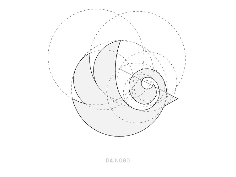
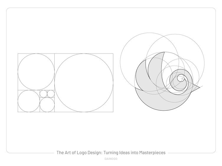
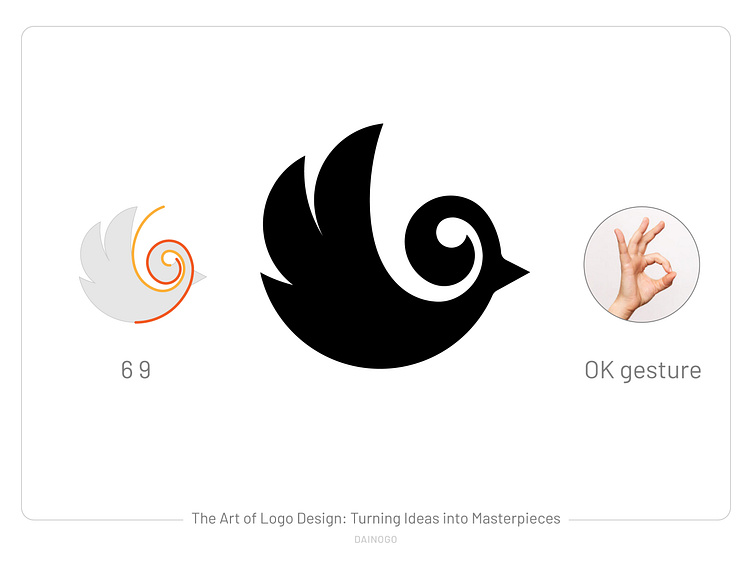
For example, after thoroughly researching a brand, I got the idea of combining birds with the numbers 6 and 9. My initial sketch looked like this:
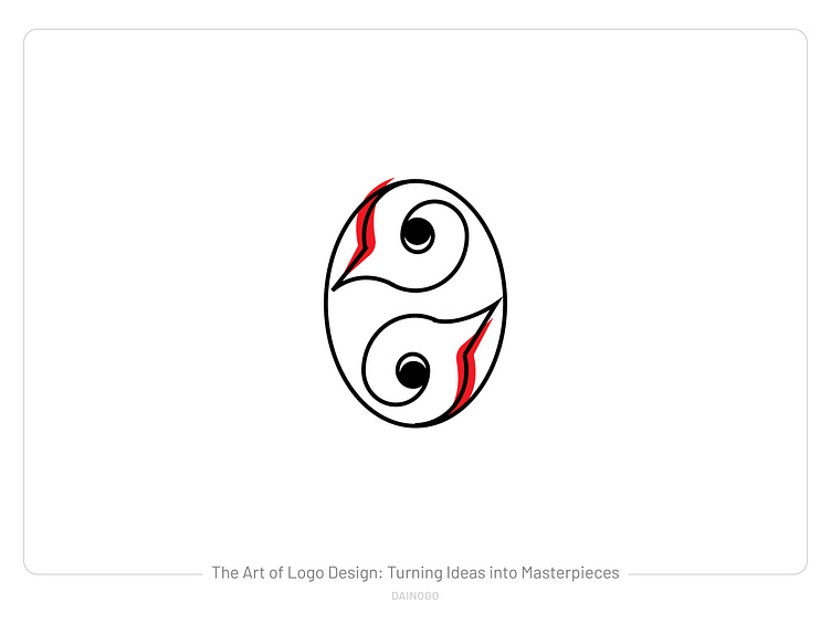
Pretty terrible, right? I then worked on simplifying it, refining the lines, and eliminating unnecessary details.
I won’t go into too much detail about this process since it mainly relies on experience and creativity. If you're interested, you can check out my detailed blog post here: 👉 THE LOGO DESIGN PROCESS
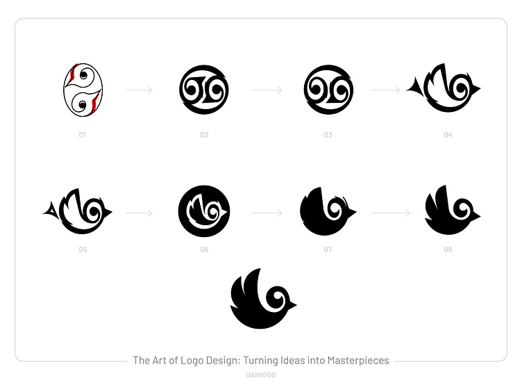
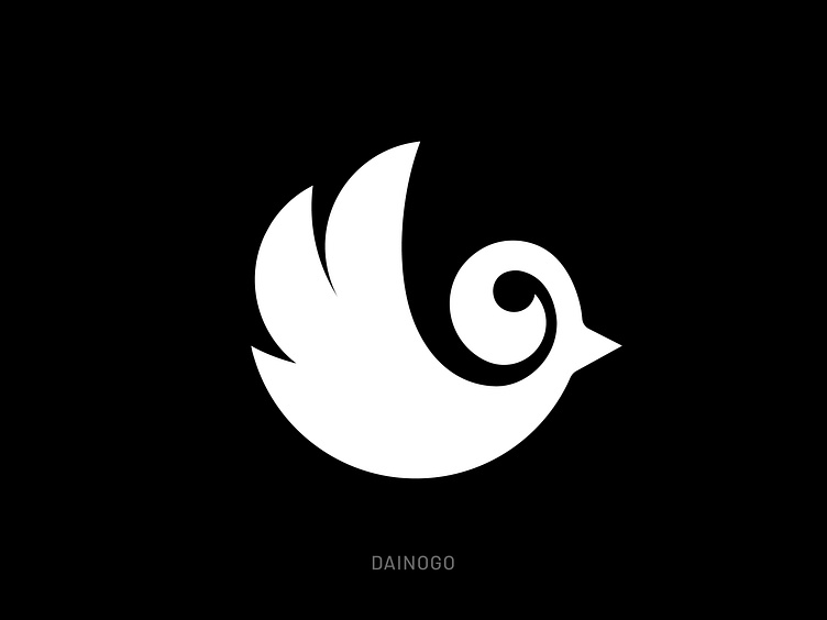
What do you think about this one?
I hope this article offered useful insights and inspired you to fuel your creativity on your own logo design journey!
Related work: bird logos | animal logos