Cake Shop UI Design 🍰
Project Overview
A UI design for a cheerful and enjoyable cake shop e-commerce, designed to enhance the user experience when shopping for cakes online.
Problem Statement
Complicated navigation and lack of clear information are often obstacles in the online cake shopping experience.
This design aims to provide easy and intuitive navigation for cake categories, while presenting complete information such as ingredients, nutritional values, and order time.
The goal is to deliver a more guided, transparent, and enjoyable shopping experience for users.
Design Process
Research & Ideation
I started the project by looking for design inspiration on Dribbble. From there, I decided to create a cheerful and fun e-commerce design for a cake shop.
I also conducted research on essential e-commerce elements, such as product categories, ingredient information, nutritional values, and order lead times, which should be included in the platform.
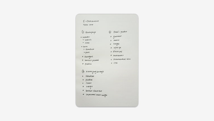
Information Architecture (IA)
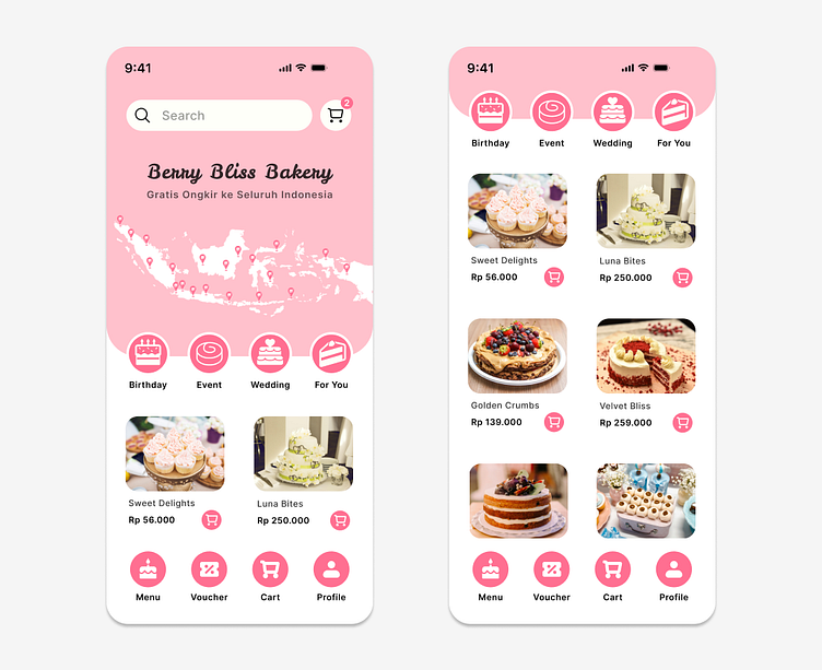
Given the time constraints, I focused on three main pages for this prototype: the homepage, product detail page, and shopping cart.
I noted the key elements that needed to be on each page, such as product images, descriptions, and ordering buttons, and determined a simple navigation structure.
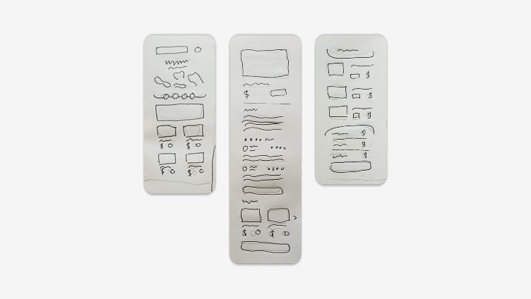
Wireframing
After finalizing the page structure, I sketched wireframes on paper to visualize the layout and user flow.
This step helped me ensure that the placement of important elements, like images and buttons, was effective in supporting a smooth user experience.
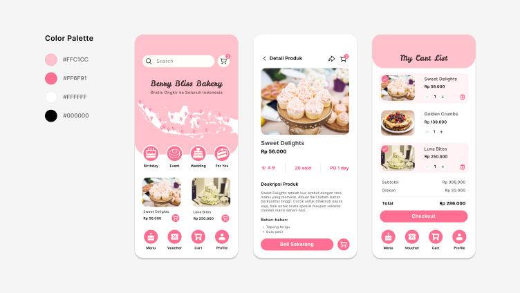
UI Design
Once the wireframe was complete, I moved on to the visual design in Figma.
I chose a bright color palette using pink and white to create a cheerful, clean feel that suited the cake shop theme. The design focuses on easy navigation and a pleasant shopping experience for users.
Prototyping
After completing the design, I created an interactive prototype to illustrate the user flow and functionality of each element.
This prototype helped visualize the overall user experience and allowed me to test interactions between elements in the design.
UI Testing
To ensure a more intuitive design, I conducted self-testing with a focus on two key aspects:
Consistency & Navigation: I checked whether UI elements, such as colors, icons, and layout, remained consistent across all pages, allowing users to navigate easily.
Readability & Contrast: I ensured that the text had an appropriate size and good contrast to enhance readability, especially for important details like ingredients, nutritional information, and pre-order time.
This project was a valuable experience in designing an intuitive e-commerce platform with clear navigation and comprehensive product information. I really enjoyed the process and welcome any feedback!
