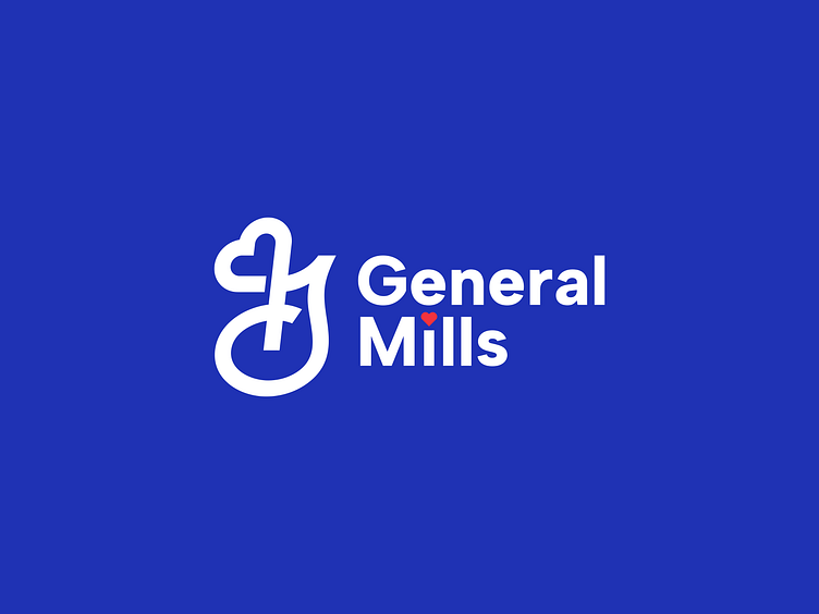
Redesign Logo General Mills
At Garagephic Studio, we took on the fun challenge of reimagining the General Mills logo!
As a leading U.S. food company, General Mills is known for its iconic brands, and we wanted to give their logo a fresh, modern spin.
In our redesign, we made the lines smoother for a cleaner, more dynamic look.
The heart, which represents warmth and care, is now more integrated and stands out beautifully. The new design is also versatile, perfect for packaging, digital use, and more.
We’re excited about how it turned out! Swipe to compare the original with our redesign and let us know what you think—does our version win your heart? ❤️
At Garagephic Studio, we love taking on creative challenges, and this time, we decided to simplify the packaging design for General Mills. Our goal was to create a fresh, clean look that’s easy on the eyes while still being impactful and memorable.
We focused on stripping away unnecessary elements, letting the design breathe, and highlighting the essentials. The result is a packaging that’s modern, straightforward, and speaks directly to the audience without overcomplicating the message.
For us, simplicity isn’t about doing less—it’s about doing it right. And with this redesign, we’re proud to have crafted something that feels effortlessly simple yet undeniably effective."
Let me know if you want any tweaks!


