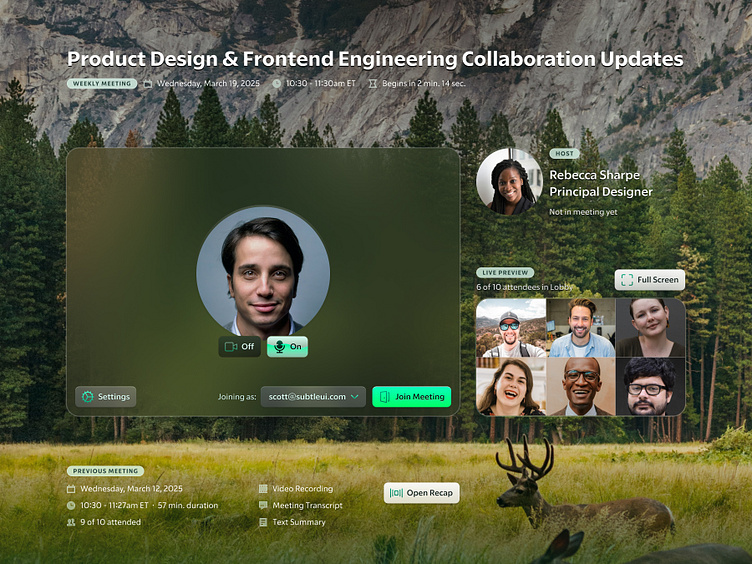
Salesroom Lobby Concept
A few years back, I was asked by Salesroom to mock up some concepts for a video conferencing experience.
Referred to as the "lobby", it would be an upgrade from the typical blank screen users face when opening a Zoom, Google Meet, etc. video conference.
Users would be able to see the live video of other attendees before joining the call themselves.
I mocked up a few concepts. The project ended up getting scrapped later on, but I figured I'd share one of the concepts. I reworked the visual design a bit from what I submitted years ago, but the core layout is largely unchanged.
There are a lot of little details that make this a striking visual departure from standard conferencing experiences (both then in 2022 when I did the original work, and still to this day).
Let's explore those details
Background blur is a commonly used effect by designers today, but many just apply the effect to the layer, lower the opacity of the fill color, and call it a day. The blur applies uniformly across the entire frame/layer. This works okay in most instances.
But...
I wanted to use the background blur more uniquely. By applying a radial gradient with a transparent color, I fade the blur out at the edges, so that the a bit of the background image bleeds through, unblurred. It's subtle but striking.
When active, the microphone button shows a subtle wave form of incoming audio. A subtle text-shadow ensures that the label remains crisp and visible when this waveform effect is moving.
I love creating custom icons for every one of my own projects, as well as many client projects. But, given the tight timeline for this project, along with the fact that the work did not continue beyond the concepts, I used pre-made icons.
I've used Nucleo icons for nearly 10 years as the starting point for projects where I'm not tasked with creating bespoke icons. They're drawn with incredible consistency, visual weight, and with 30,000 icons, there is rarely an instance where an icon doesn't exist.
In this project, I used both 16px and 24px icons, for status indicators and action items, respectively. I matched the visual style of the icons to the rest of the UI, with translucent fill, stroke effects, and background blur.
The background photo as well as user photos were sourced from Unsplash


