Miami Dolphins (brand refinement)
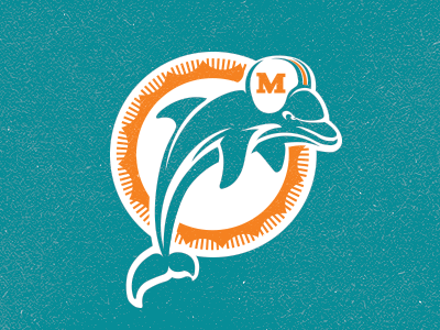
Work in progress... personal project re-approaching the Dolphins rebrand from a few years back. The throwback Monday night game from this past season inspired this concept by the overwhelmingly positive response the uniforms received as many fans hoped the Dolphins would revert back to the former aesthetic from the glory years. Being a lifelong phins fan I was a little disappointed with the total abandonment of the previous logo and its rich history. For this redesign I pulled elements from each era of the dolphins brand while holding on to the logo marks true form. The direction shown is a brand mark that embodies the Dolphins current pantones while reverting back to the two-tone color scheme from the 60's-early 90's. The dolphin itself is more modernized and the sun ring is a direct homage to the original mark. This logo would fall in line with today's more timeless trend of vintage modern and would give dolphin fans the same feeling of nostalgia they've always connected to with this historic franchise.