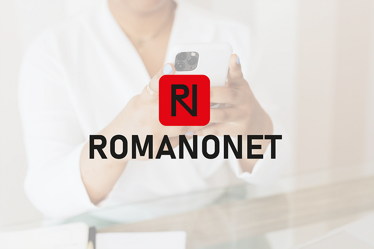
Logo design and guidelines - ROMANONET
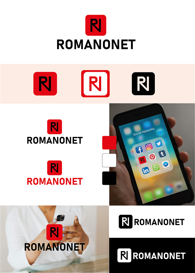
Guidelines that I received from the client - The logo had to include the letters R N, to be placed in a red graphic element and have the name of the social network written. The main color had to be red.
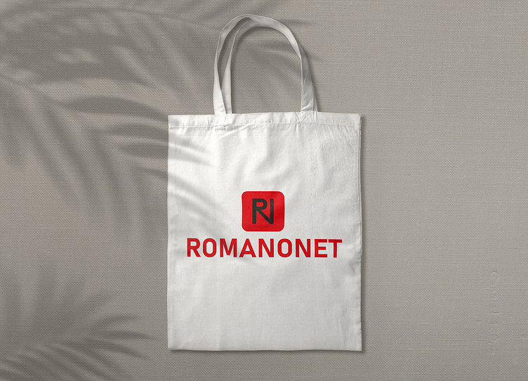
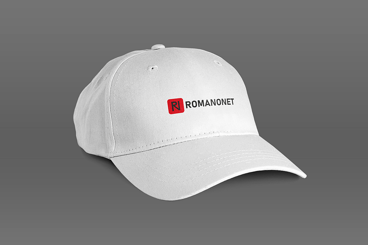
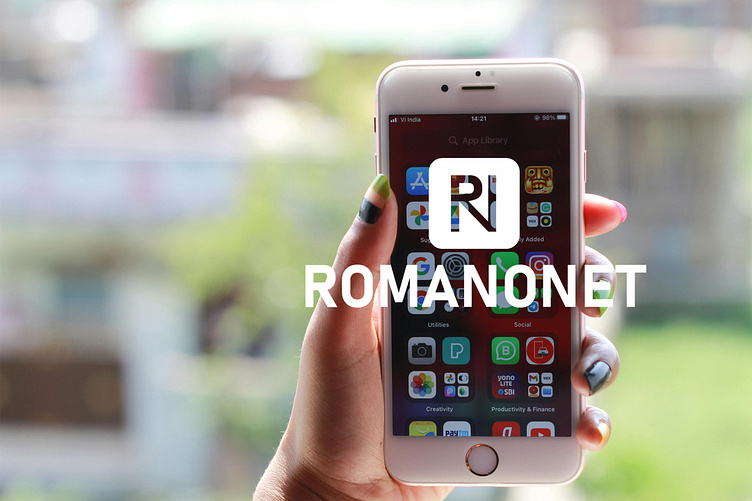
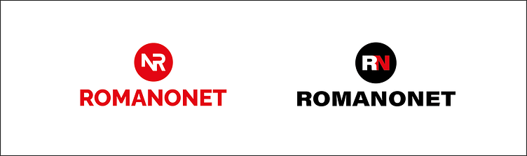
Design solution - The logo that I made represents the letters R and N, which intertwine with each other, in a red square with rounded edges. In this way, the graphic element can also be used for a fav icon.
Color palette - the main color is red. It is a very dominant color, respectively, as secondary colors I proposed its monochrome variants, as well as white and black, which fit in perfectly.
The chosen font is consistent with the fact that the design is intended to create a social media brand, universal and elegant, without additional elements.
The elements that I had to develop for the brand identity: Logo; Typography; Color palette; Safe zone; Usable logo variations; Correct and incorrect use; Brand book.
I worked with the following programs: Adobe Illustrator, Adobe Photoshop, for creating a brand book - Adobe InDesign.
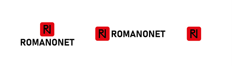
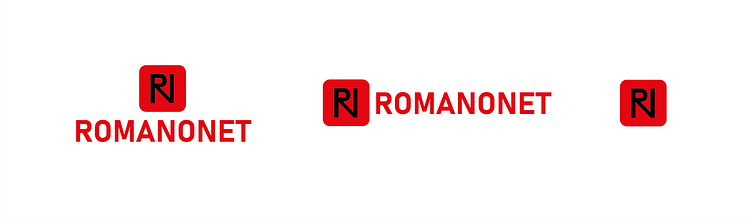

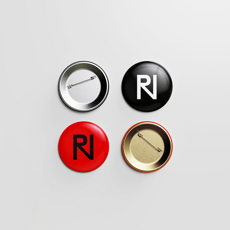
Other versions of the logo:
Thank you for your attention!
Contact and follow me:
https://www.linkedin.com/in/mariyana-stoyanova-design/
https://www.instagram.com/mgs_creative.and.design/
https://www.facebook.com/profile.php?id=61551653620432
https://www.pinterest.com/mariyana_g_stoyanova/
mariyana.g.stoyanova@gmail.com
https://www.upwork.com/freelancers/~01df635ee6934c5c9c?viewMode=1
Check out my digital business card and follow me on social media :
