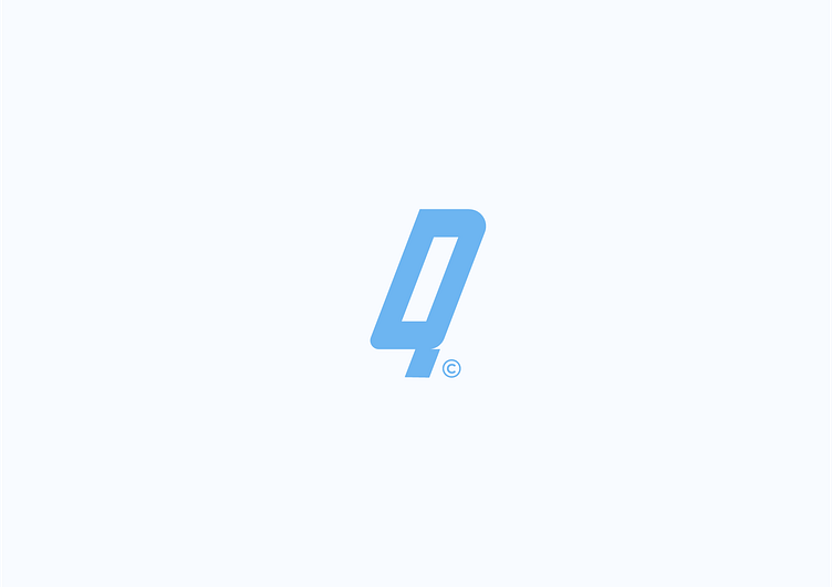
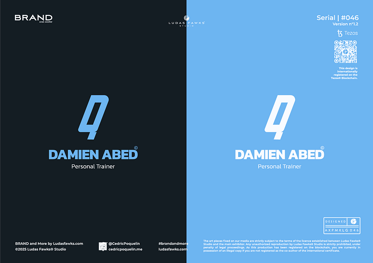
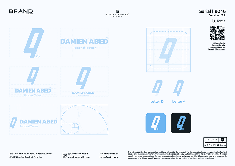
Logo | Damien Abed©
About the project
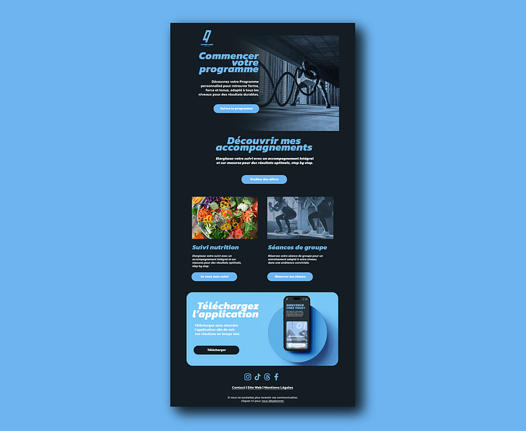
Damien Abed is a personal coach based in northern France who passionately and expertly supports his clients in achieving their fitness and nutrition goals. He offers personalized programs tailored to each individual's needs and aspirations, while ensuring rigorous follow-up to maximize results. Damien Abed is committed to providing comprehensive and motivating guidance, enabling his clients to reach their goals sustainably.
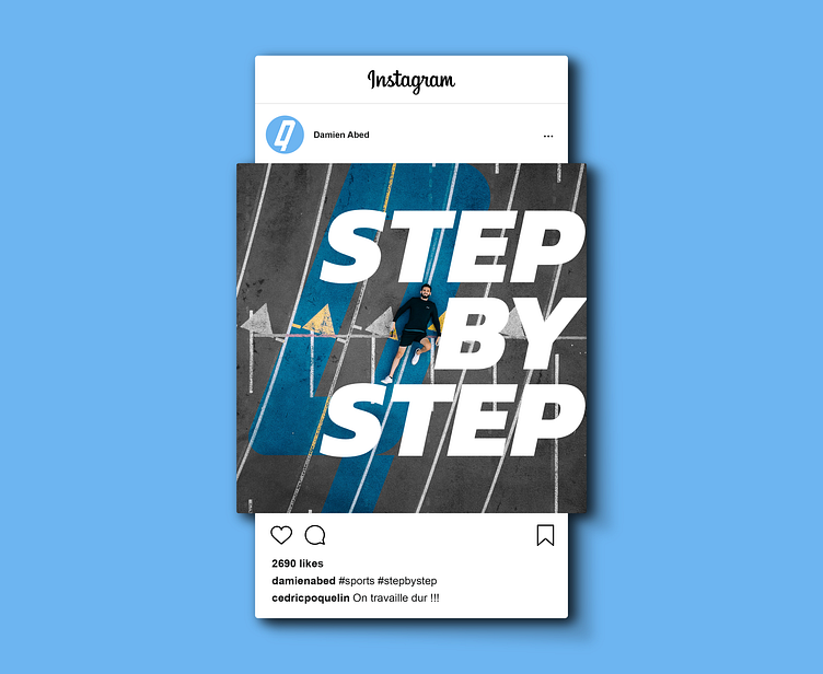
Step by Step
Beyond his pragmatic approach, which focuses on developing human potential, Damien Abed also stands out for his ability to support his clients with remarkable precision and expertise. His added value lies particularly in the quality of his personalized follow-ups, which he enhances through the use of the Hexfit system. This innovative technological tool not only ensures comprehensive and precise tracking of each client's progress but also optimizes their performance by relying on reliable data and detailed analyses. Thanks to this unique combination of human expertise and technology, Damien Abed provides his clients with optimal coaching.
Conception
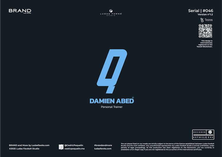
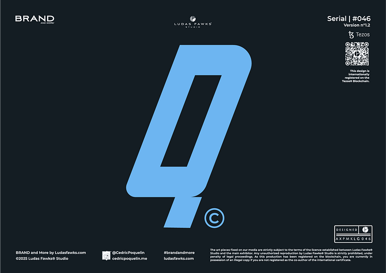
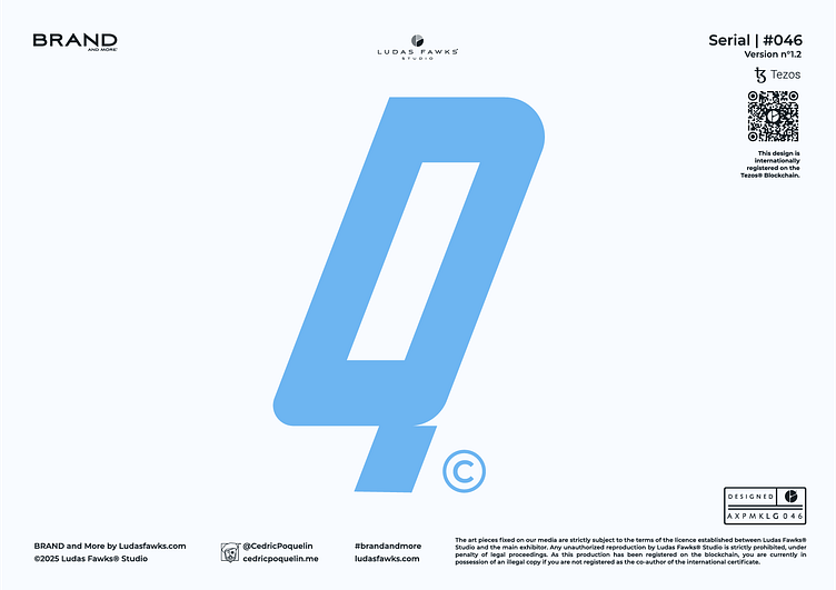
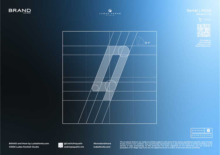
In this design, the logo has been stylized in the form of a monogram containing the letters D and A. The shape benefits from an angle of 9° to give it an impression of natural movement. In order to compensate for the off-centering of the shape and due to the elongation of the monogram, the mass had to be reinforced at its base by doubling its thickness, which gives a solid foundation to the logo, without making it lose its aerial appearance and dynamic.
The shape was developed with a voluntary asymmetrical ratio in order to have both vertical energy, but also from left to right. The central part has a ratio of 4, the lower part has a ratio of 2 and the upper part has a ratio of 1.
Font
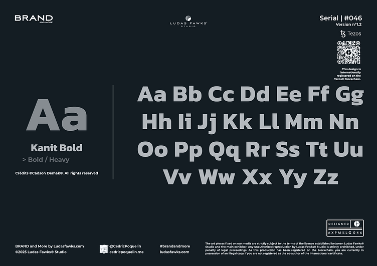
The typography used is ©KANIT, developed by the prestigious Thai agency Cadson Demak®. The foundry remains specialized in typographic advice and typeface design, which gives it a strong mastery in the creation of modern fonts. From the family of linear typographies, Kanit© benefits from a natural elegance and a certain intrinsic strength, in line with modern Thai typographies. Its range of weights allows it to be used effectively in layouts that are both bold and light.
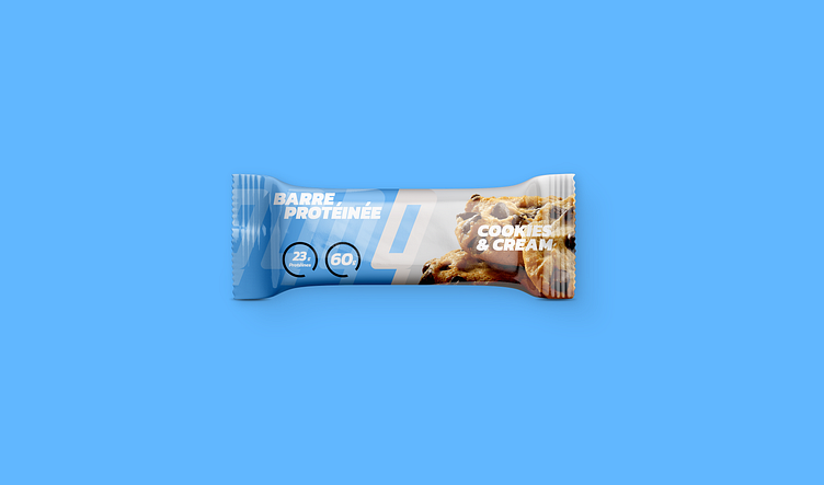
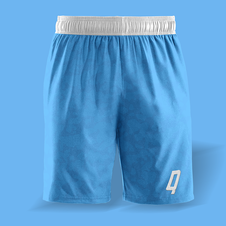
Colors
The colorimetric ambiance of the identity revolves around cobalt blue, which constitutes the central theme of the identity. The other shades are variations or accentuations of this color in order to highlight it throughout the deployment of the visual identity. The whole delivers a measured dynamism which subtly denotes the competing branding of sports professions.
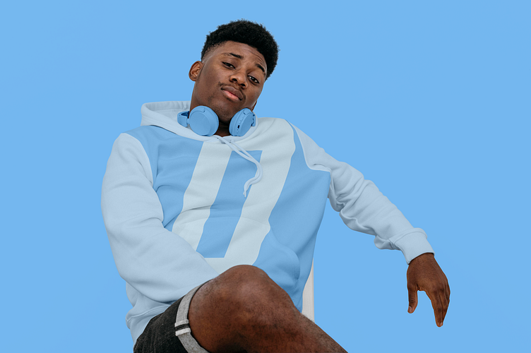
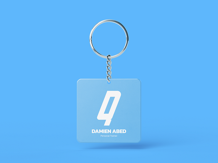
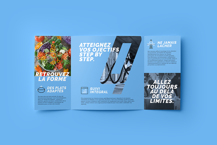
Applications
This Branding has a strong impact on mediums such as sports gear and more casual textiles. Its colors also enhance print materials like leaflets. The versatility of this branding appears to be limitless.


Copyrights
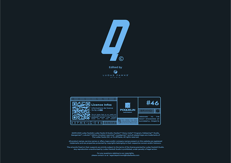
The art pieces fixed on our media are strictly subject to the terms of the licence established between Ludas Fawks® Studio and the main exhibitor. Any unauthorized reproduction by Ludas Fawks® Studio is strictly prohibited, under penalty of legal proceedings. As this production has been registered on the blockchain, you are currently in possession of an illegal copy if you are not registered as the co-author of the international certificate.
This design is internationally registered on the Tezos® Blockchain.
_______________________________________
Ready to Work on yours?
and make something great with your project !
_____________
What We Do
Contact
> What'sApp | > E-mail : hello@cedricpoquelin.me
Let's Follow
> Behance | > Instagram | > Facebook > Linkedin
_____________
© 2025 Ludas Fawks® Studio X Cédric Poquelin. All Rights Reserved.
