Aaron Pierre for GQ: A Bold Visual Statement
Aaron Pierre for GQ: A Bold Visual Statement
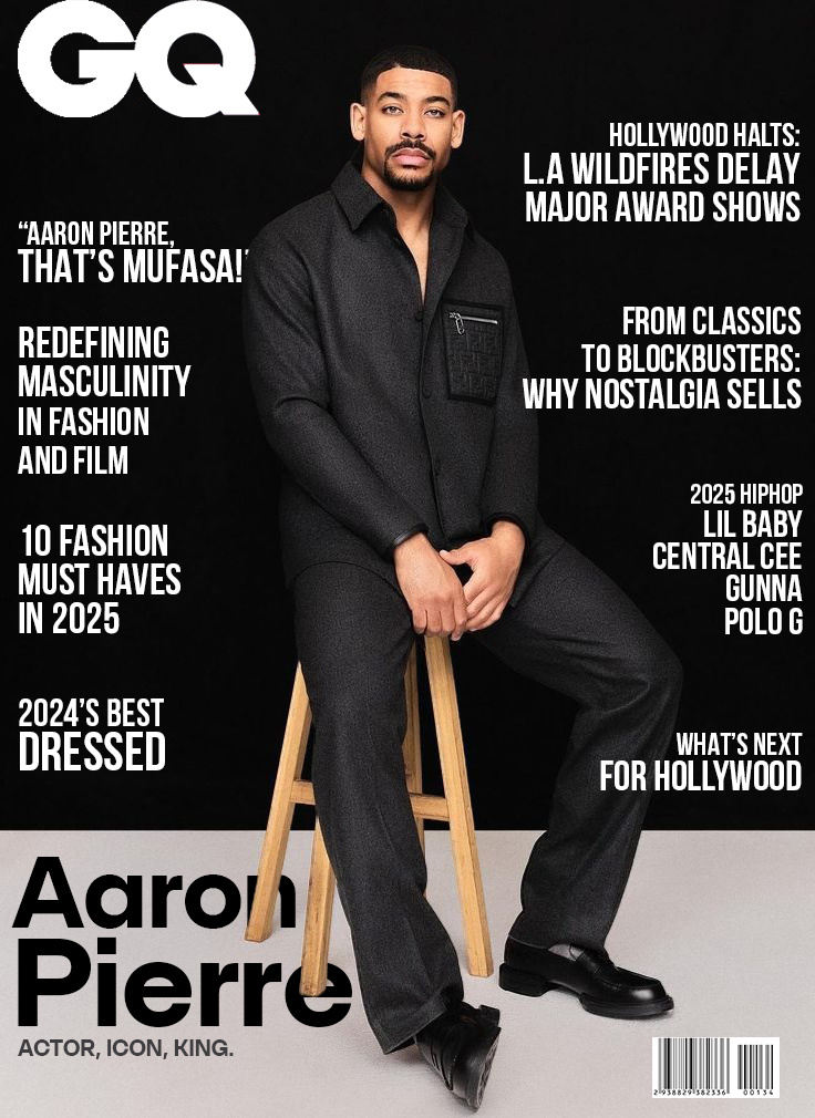
Overview
This project is a conceptual magazine cover design featuring Aaron Pierre, blending modern elegance with a touch of raw charisma. Inspired by Aaron's magnetic presence and GQ's reputation for timeless style, the cover highlights the balance of sophistication and edge.
Design Approach
Typography: Clean, modern fonts were chosen to evoke GQ’s signature aesthetic, paired with bold accents to highlight feature articles.
Color Palette: A rich, moody color palette accentuates the sophistication of the subject while maintaining the magazine's luxe vibe.
Imagery: The cover's focal point is Aaron Pierre in a powerful pose, captured to convey confidence, poise, and charisma.
Layout: Balanced and intentional, the composition ensures that all elements—the masthead, headlines, and imagery—work harmoniously to grab attention and tell a cohesive story.
My Role
As the designer, I was responsible for every aspect of the project, including conceptualization, layout design, typography, and color grading. The goal was to reflect GQ's iconic style while introducing a fresh perspective.
Conclusion
This project was a blend of creative storytelling and design precision. It stands as a tribute to both GQ's legacy and Aaron Pierre's emerging influence.
