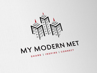
My Modern Met Logo [Final]
It's been quite a slog this one, but we finally have arrived at the final design. A few subtle tweaks here and there, introduced the red as the website has a black and red colour scheme.
The main change being the tag line, decided to dump the sans-serif/serif combo and opted for a full on sans solutions. So the tag line is clearer, bolder and also... red. :)
There are several orientations of this logo, the website version is a wide landscape version.
Thank you for all the feedback over the course of this project, have implemented most of the suggested changes and it looks better for that. :)
Go Dribbble.
More by Smitho.graphics℠ — Logo & Icon Design Studio View profile
Like

