Give vNext
Working at Microsoft, I helped launch 'Give vNext,' a charity platform that connects over 200,000 employees to a world of giving. As the primary designer on the platform, my role was to create an intuitive user experience and user interface, making charitable contributions easy and fostering a spirit of giving within the company. I worked with a business team to help them meet their financial and employee participation goals for the and an engineering team to meet a very tight platform delivery date. It was an extremely challenging and fast paced working experience but very rewarding at the end of it all.
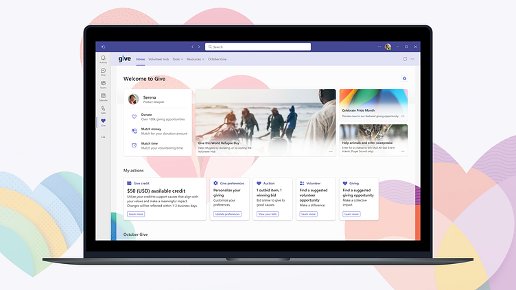
In an effort to enhance 'Give vNext,' we revamped the landing page for both desktop and mobile. The aim was to align it with Microsoft's employee experience tools, offering a personal and valuable user experience. We introduced a profile feature to help users establish their philanthropic identity, along with the 'My Actions' dashboard for easy access to the primary actions a specific user might be most likely to take. These changes not only modernized the page but also made charitable engagement more accessible and meaningful for every employee.
To meet the business goal of increasing employee participation in both volunteer opportunities and the October giving season campaign, we introduced 'October Give' and the 'Volunteer Hub' pages as elevated experiences. These pages serve a dual purpose: promoting specific 'October Give' events and making volunteer opportunities easily accessible. Previously, these resources were buried in the user interface, but our redesign made them user-friendly and readily available. The result was a more engaging and accessible experience for Microsoft employees.
The 'Give vNext' project also encompassed a collection of static info pages, primarily dedicated to informational and help content. Managing a diverse array of content, including substantial volumes, was a significant challenge. These pages needed to act as a concise and organized repository for all types of information, ensuring clarity and ease of access. Furthermore, we recognized the importance of visual flexibility in accommodating various content formats and ensuring that the user experience remained smooth, even in the face of a wide range of possibilities.
As the 'Give vNext' project evolved, so did our user experience strategy. The initial wireframes underwent significant transformations to align with shifting business objectives and engineering constraints. Flexibility and adaptability became paramount as we accommodated various moving parts within the project. This dynamic approach allowed us to stay responsive to the changing landscape, ensuring that our design not only met but exceeded expectations.


