Logo Design for HEPI Enterprise
Enter your text here...I'm excited to share the new logo I designed for HEPI Enterprise!
This project was a fantastic opportunity to blend creativity with strategic branding, aiming to capture the essence of what HEPI Enterprise stands for—innovation, energy, and professionalism.
Design Elements Breakdown:
1. Color Scheme:
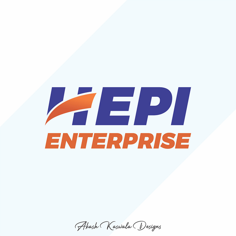
Blue: Represents trust, stability, and professionalism. It's a color that resonates well with reliability, making it perfect for a business that prides itself on delivering dependable solutions.
Orange: Brings in energy, enthusiasm, and a sense of dynamism. It complements the blue by adding a vibrant, forward-thinking element, suggesting growth and innovation.
2. Typography: The bold, sans-serif font conveys strength and confidence. It's clean, modern, and easy to read, which enhances the brand's approachability and clarity in communication.
3. Iconography: The swoosh cutting through the "H" symbolizes movement and progress, indicating that HEPI Enterprise is always moving forward, adapting, and innovating. It adds a dynamic flair to the design, making the logo visually engaging and memorable.
4. Layout: The alignment and spacing are meticulously balanced to ensure the logo is versatile across different mediums, from digital platforms to print. The "HEPI" is emphasized with a strong, assertive presence, while "Enterprise" supports it with a solid foundation, reinforcing the company's identity.
Design Process:
The design process involved understanding HEPI Enterprise's core values and long-term vision. After several brainstorming sessions, concept sketches, and revisions, this final design emerged as a perfect representation of the brand's identity. The goal was to create a logo that is not only aesthetically pleasing but also resonates with the company’s mission and audience.
Final Thoughts:
As a graphic designer, I believe a logo should tell a story, convey values, and leave a lasting impression. This logo for HEPI Enterprise is designed to do just that. It’s a visual embodiment of their commitment to innovation and excellence, ready to take on the future with confidence.
I’m proud to have been part of this project and am excited to see how this new visual identity will help propel HEPI Enterprise forward.
