Artflow Dashboard - My first SaaS design
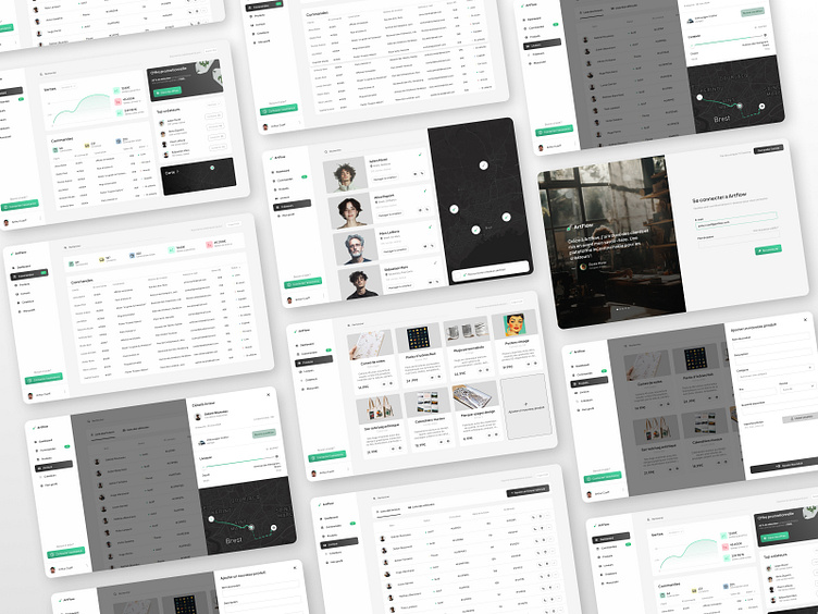
Artflow is my first attempt at designing a SaaS dashboard. My goal was to practice creating a clean, intuitive, and functional interface. Each section—from the creators’ list to the product management—was designed with simplicity and clarity in mind.
This project marks a milestone in my learning journey, as it helped me understand the fundamentals of dashboard design while preparing me to take on more complex challenges. Feedback is more than welcome!
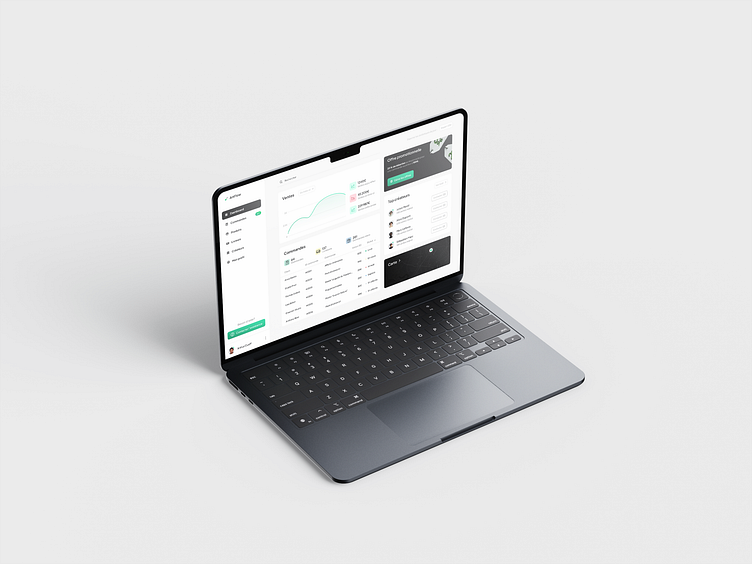
Main Dashboard
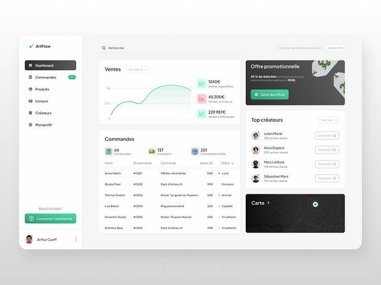
An intuitive overview to track orders, sales, and creators’ performance. Simplicity was at the core of this design to enhance navigation.
Orders List
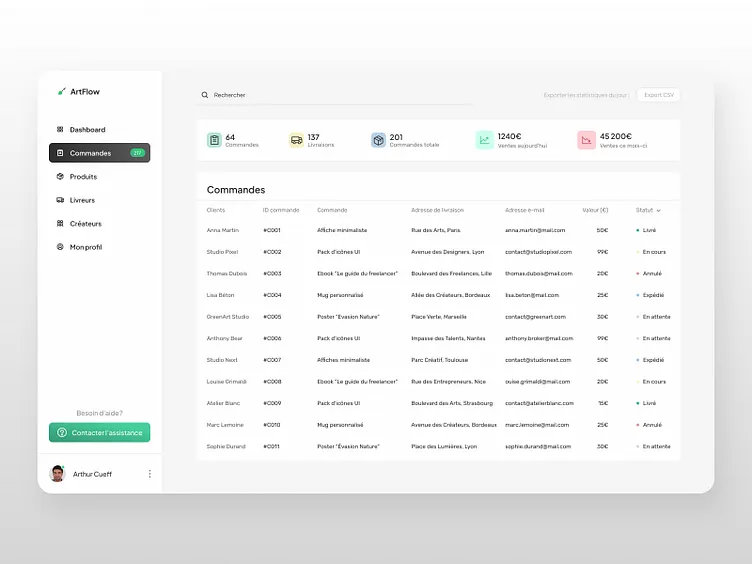
A detailed table of orders with status, value, and client information. The design focuses on readability and easy access to essential data.
Delivery Details
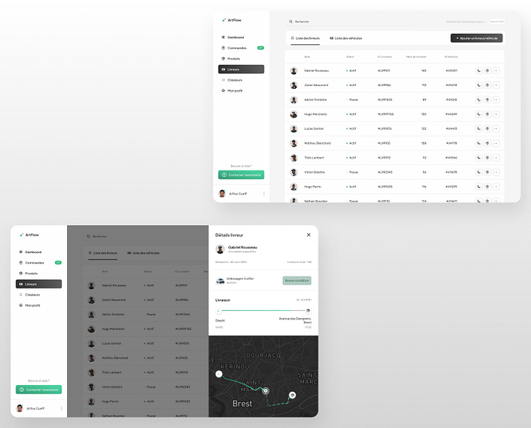
Driver and vehicle management with a clear interface, integrating geolocation tracking for improved logistics accuracy.
Creators Section
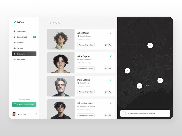
Showcasing creators with geolocation and quick management options. A focus on highlighting local creators.
Product Management
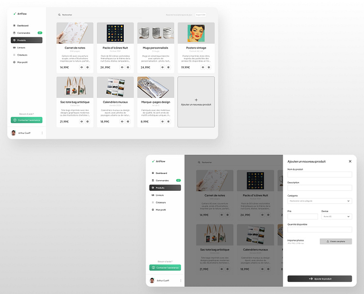
A product showcase with smooth navigation for quickly adding, editing, or reviewing stock information.
Login Page
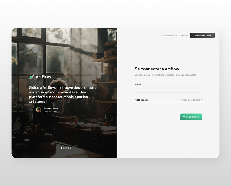
A simple and welcoming interface for platform access, featuring a client testimonial to boost credibility.