ETIME Logo & Uniform Design
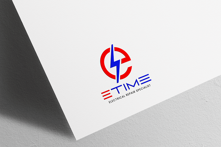
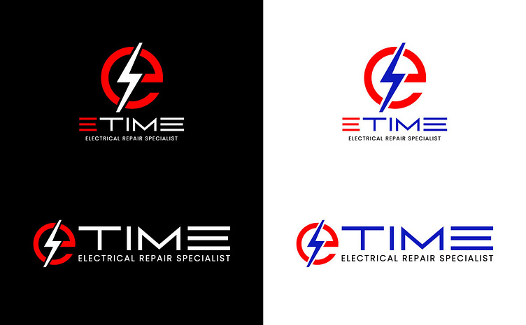
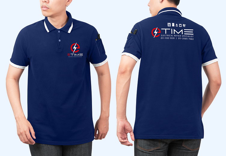
eTime is a professional household electrical repair company that prioritizes reliability and efficiency. For their logo, I aimed for a clean and modern design that reflects their expertise. The color scheme features red and blue—red conveys energy, urgency, and action, while blue represents trust, professionalism, and technical precision. These colors are also widely recognized in electrical wiring, reinforcing the brand’s industry connection.
To maintain a sleek and contemporary look, I chose a sans-serif typeface, ensuring the logo remains uncluttered, modern, and easy to recognize. The typography enhances readability while reflecting a no-nonsense, professional approach. This combination of colors and typography ensures eTime's branding is both visually appealing and strategically aligned with its industry.
