Vilmart Logo Design
Vilmart
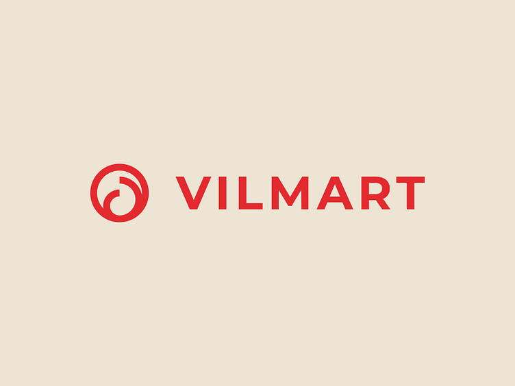
The logo for Vilmart combines geometric elegance and abstract symbolism to create a visual identity that is both dynamic and modern. The design is built upon the letter “V,” a significant element as the name is derived from the two founders, each with names starting with “V.” The logo features the outline of a circle as the primary shape, representing unity, continuity, and wholeness. Within the circle, attached to the bottom, are two smaller half-circles carefully sized using the Fibonacci sequence. This mathematical approach ensures balance and harmony, making the design naturally appealing.
The two half-circles subtly form the impression of two “V’s” facing each other, symbolizing the partnership and duality behind the brand. The use of a bright red brand color conveys passion, energy, and creativity, aligning perfectly with the store’s focus on dynamic and stylish interior design solutions. The minimalist aesthetic allows the logo to feel modern and timeless, making it suitable for a forward-thinking interior design store.
