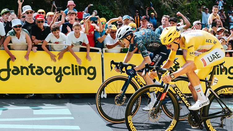
FANTACYCLING
CONCEPT
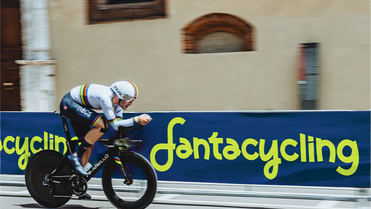
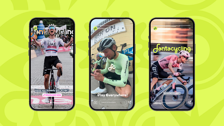
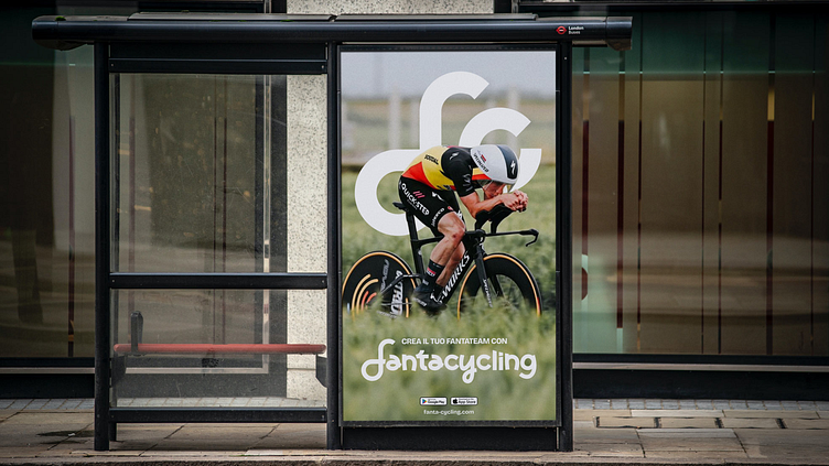
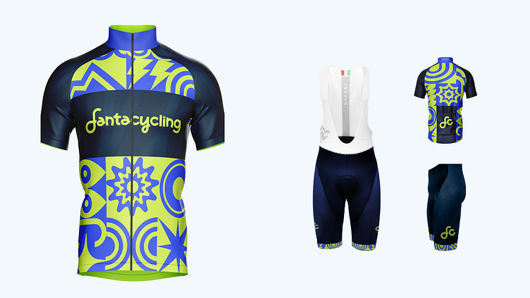
The rebrand stands out for its bold and playful character, maintaining continuity with the key elements already familiar to the audience while expressing energy, audacity, and dynamism through a fresh and vibrant color palette, contemporary shapes, and bold textures with a decisive graphic approach. The visuals present a more engaging aesthetic, designed to make an impact and communicate a sense of belonging to an innovative and passionate community
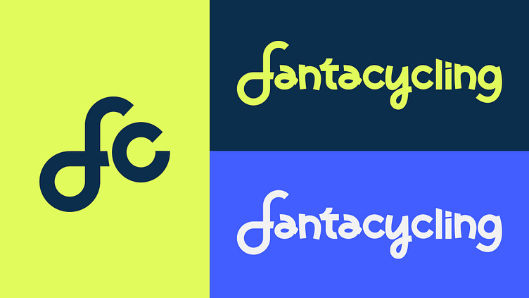
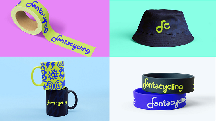
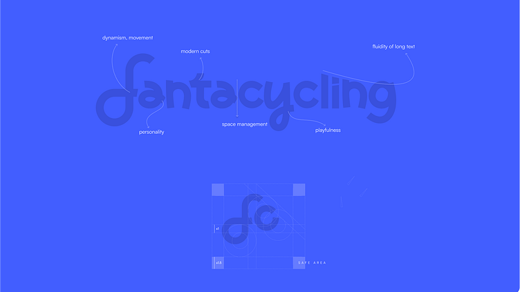
LOGO
The redesigned logo features an extended wordmark with balanced emphasis on both words and subtle spacing for visual continuity. The "fc" icon, inspired by a bicycle climbing a mountain, embodies the spirit of cycling. Together, these elements strike a balance between modernity and familiarity, creating a cohesive and memorable visual identity.
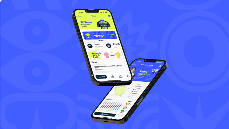
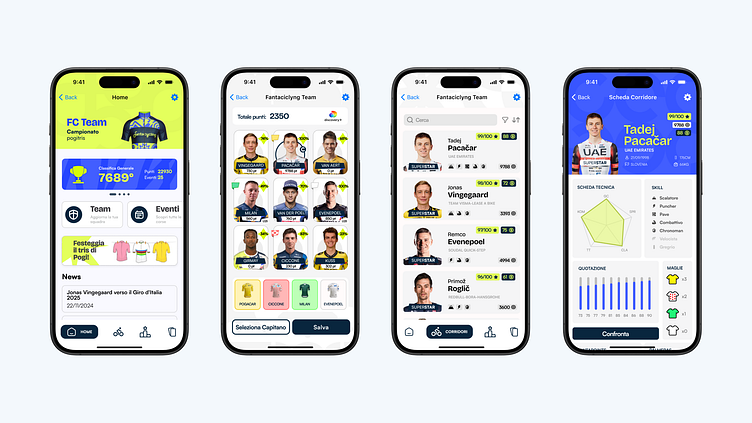
APP
The app retains a familiar structure to ensure continuity for regular users while introducing new visual elements for a more modern and contemporary experience. Fresh and bold visuals are paired with a reimagined interface, where simplified components and a thoughtful balance of weight and spacing enhance the clarity and readability of information. This approach not only improves usability but also aligns the app with the brand’s evolution, offering an intuitive and enjoyable user experience.