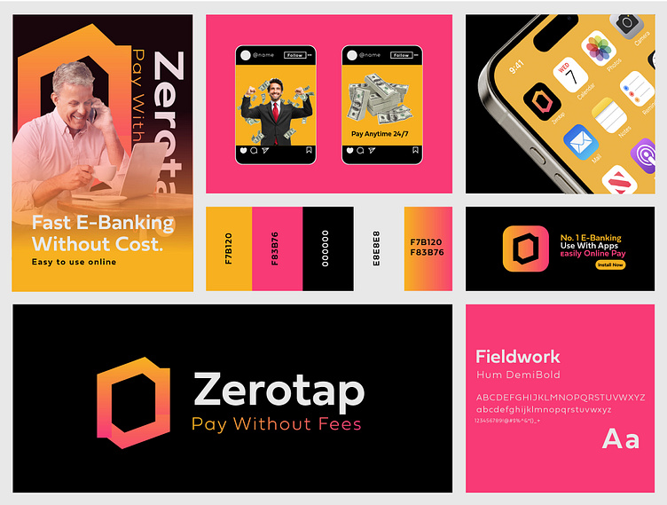
Zerotap E-Banking Logo Brand design
Zerotap is built for those who want banking to be as simple as a tap. No fees, no complications—just a clear, hassle-free way to handle payments. Our logo, inspired by a "zero" with vibrant orange and pink gradients, reflects the balance of bold innovation and effortless simplicity. We’re here to make financial freedom accessible for everyone.
---
Mission
To make digital banking easy, accessible, and fee-free, so you can focus on what matters most without worrying about unnecessary costs.
---
Vision
To lead a global shift toward transparent and effortless banking, where payments are simple, fast, and always fee-free.
👉 Let's work together and elevate your brand!
📩📩 Available for Sale $$$
→ Email: sayhellobappi@gmail.com
→ Whatsapp: +8801997545856
Follow me: Instagram I Linkedin I BehanceI
f you like this project so PLEASE hit the "Like" button.
T H A N K S !
