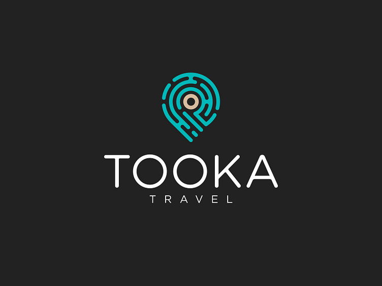
Tooka Travel Logo Design
Tooka Travel
Tooka Travel is a bespoke travel agency specializing in crafting personalized vacation experiences in Southern Asia. By leveraging the expertise and insights of locals at each destination, they ensure that every trip offers an authentic, well-rounded adventure tailored to the traveler’s preferences.
The logo design is centered around a map pin, a universally recognized symbol for location and travel. The pin is composed of intricate lines that create a maze-like or city map aesthetic, symbolizing exploration and discovery. The use of rounded corners within the map design and the logo typography reflects a softer, human-focused approach, emphasizing their commitment to personalized service and local connections.
The logo’s color palette includes a warm sand color for the center circle, representing beaches and the natural warmth of the Southern Asian region, paired with a calming green-blue for the lines, evoking a sense of tranquility and balance. This thoughtful color combination stands out in the travel industry, which often leans towards brighter, more aggressive tones, positioning Tooka Travel as a calm and refined choice for travelers.
