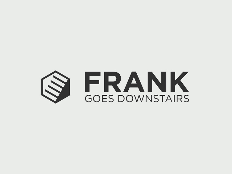
Frank Goes Downstairs Logo Design
Frank Goes Downstairs
Frank Goes Downstairs embraces a minimalist and thoughtful approach to web development, prioritizing quality over quantity by building bespoke websites from the ground up. The logo reflects this philosophy with a sleek and sophisticated design.
The primary element is a hexagonal outline, with negative space cleverly forming a staircase within. This abstract representation symbolizes the agency’s methodical and foundational approach to creating websites, step by step, without relying on bloated frameworks or underperforming CMS solutions.
The bold sans-serif typeface complements the geometric simplicity of the icon, reinforcing the agency’s modern and no-nonsense aesthetic. The monochromatic dark grey palette exudes professionalism, sophistication, and reliability, aligning with the brand’s ethos of delivering high-performance, streamlined solutions for its clients.
