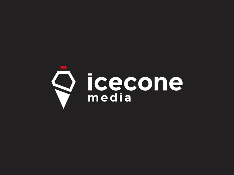
Icecone Media Logo Design
Icecone Media
Icecone Media’s rebranding presents a refined and versatile identity, moving away from the playful illustration of an ice cream cone to a modern, geometric logo that reflects the company's broad range of creative services. The logo retains the ice cone motif but reimagines it with sharp, minimalistic lines to convey professionalism and creativity.
The triangle shape of the cone subtly nods to the company’s location in Denmark’s "Triangle Area," establishing a meaningful connection to its roots. The ice cream scoop above the cone resembles the outline of a house, symbolizing Icecone Media’s role as a hub for entrepreneurs and creatives, offering shared office spaces. Finally, the red "cherry on top" adds a distinctive finishing touch, representing the company’s innovative approach and attention to detail.
