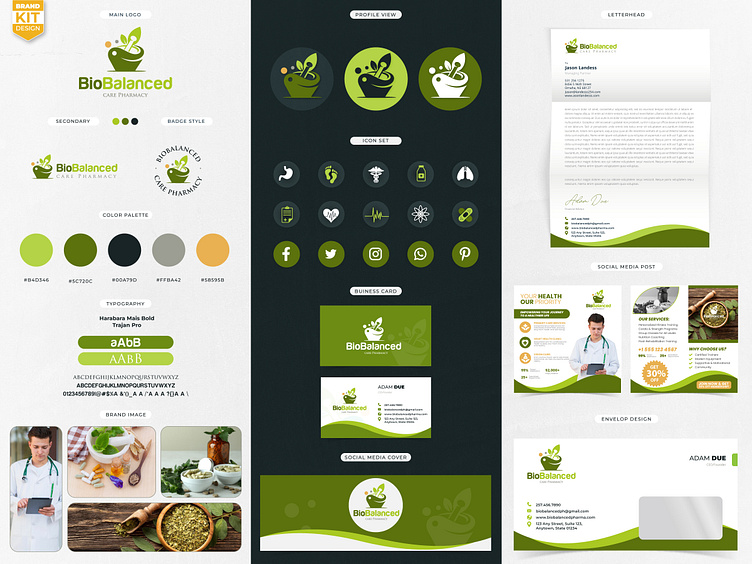
Branding kit for pharmacy logo
The BioBalance Pharmacy logo should convey the concepts of health, science, and balance, reflecting the pharmacy's commitment to providing personalized, effective health solutions.
The BioBalance Pharmacy logo combines elements of nature and modern healthcare to create a harmonious and professional design. At the center, a stylized DNA helix or a subtle leaf design symbolizes the blend of scientific expertise and natural wellness. The logo’s color palette features calming greens and blues, symbolizing trust, healing, and vitality. The font used for "BioBalance Pharmacy" is clean and modern, with smooth, rounded edges to suggest accessibility and care. A balanced, symmetrical design reinforces the idea of well-being and equilibrium, a core value of the pharmacy’s mission to support patients' health through personalized care and precise pharmaceutical services.
This logo serves to communicate both the advanced scientific aspect of pharmacy and the natural, holistic approach to health, fostering confidence in the pharmacy's services.
Direct Message / Email Me.
Mail: bulbulahmed5222@gmail.com
WhatsApp: +8801774274929
#logo #instagramlogo #needlogo #logoneed #branding #logodesign #logousageguideline #brandingkit #brandbook #brandstyleguide #brandidentity #logokit #monogram #ai #health logo
#technology #elegant #abstract #logodesingers #logoart #pharmacy logo
