FRITEUR VISUAL IDENTITY DESIGN
FRITEUR
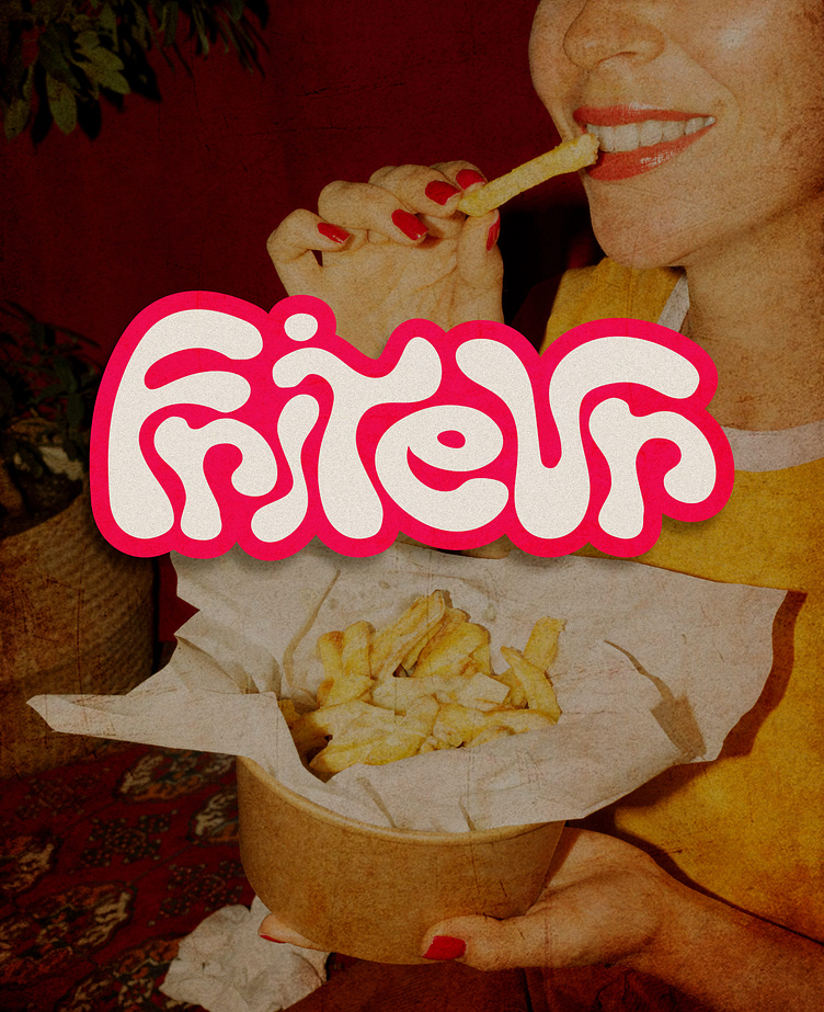
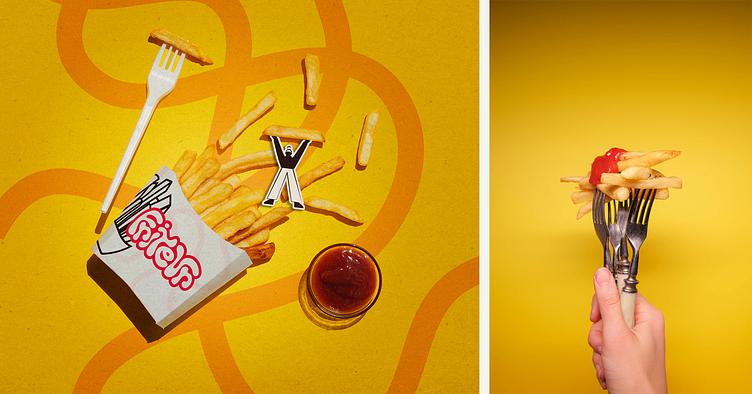
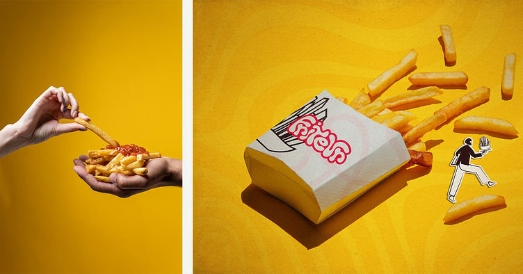
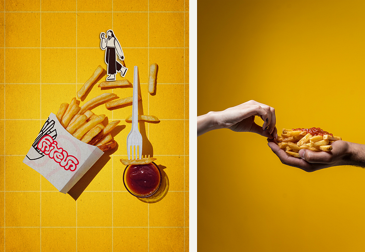
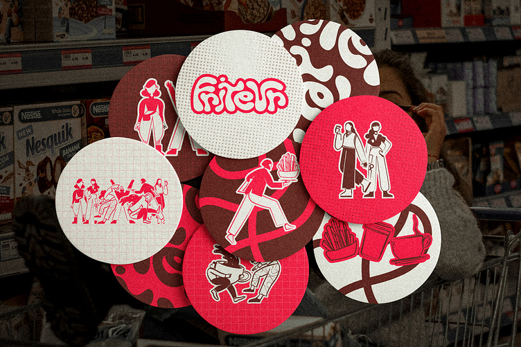
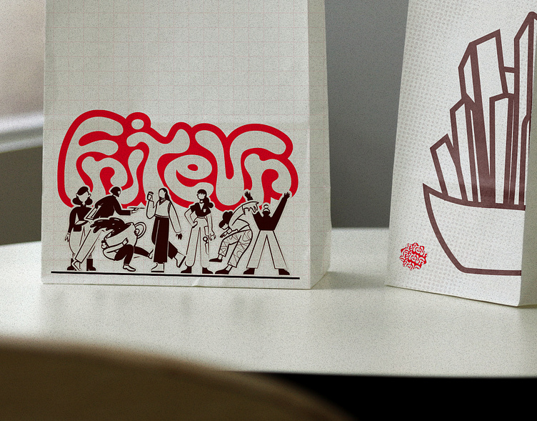
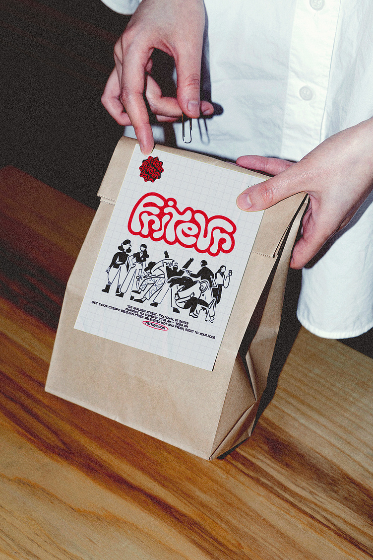
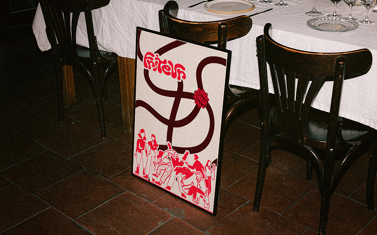
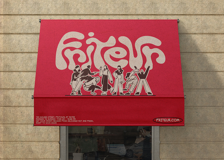
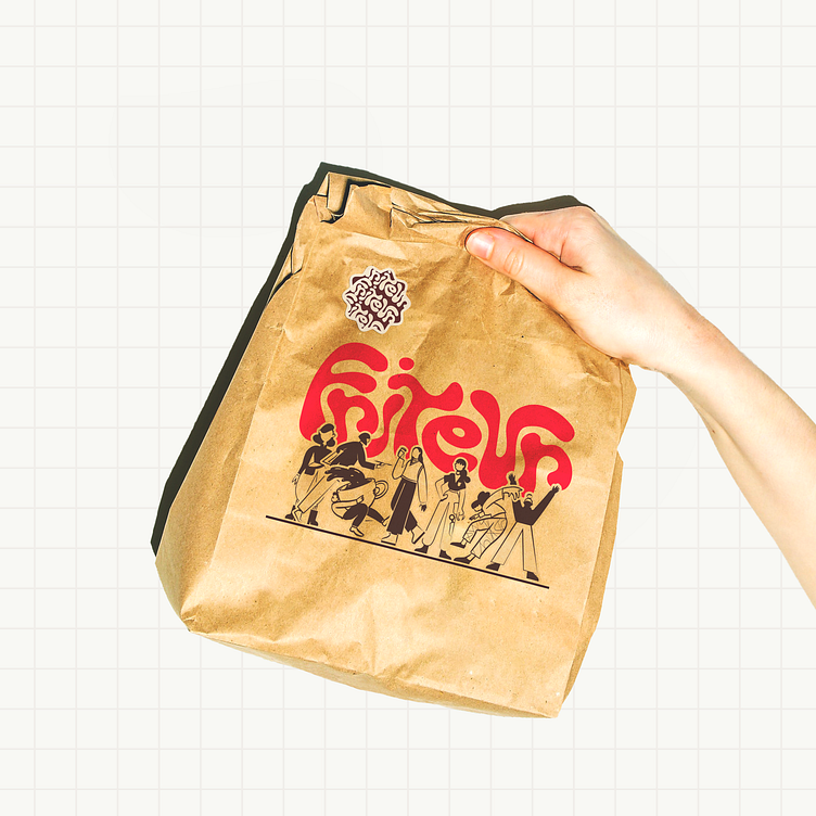
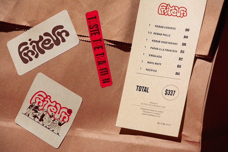
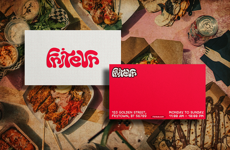
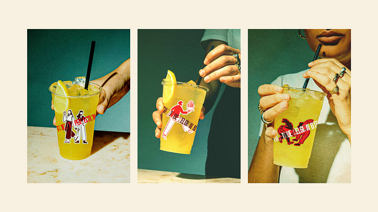
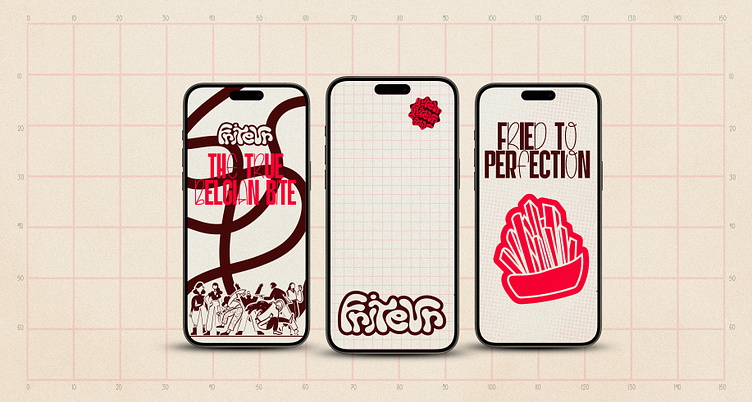
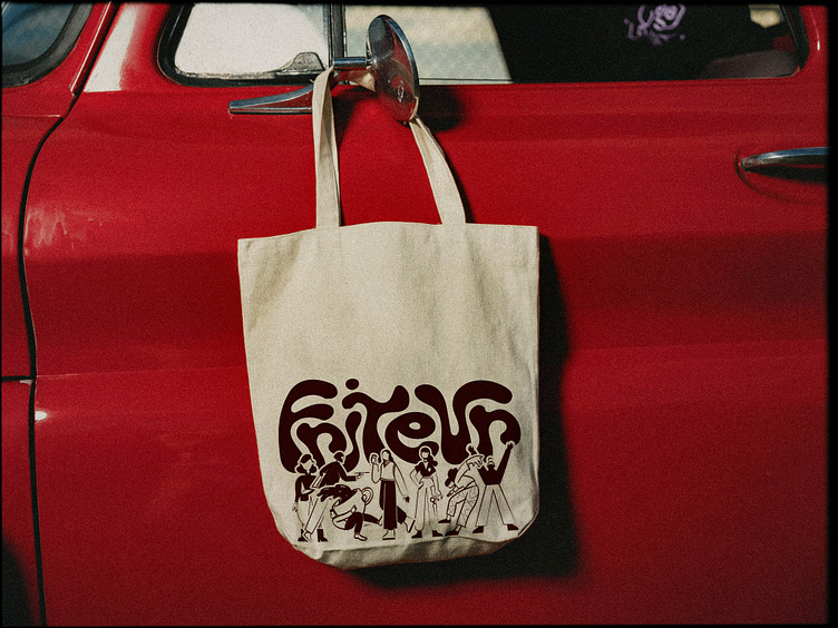
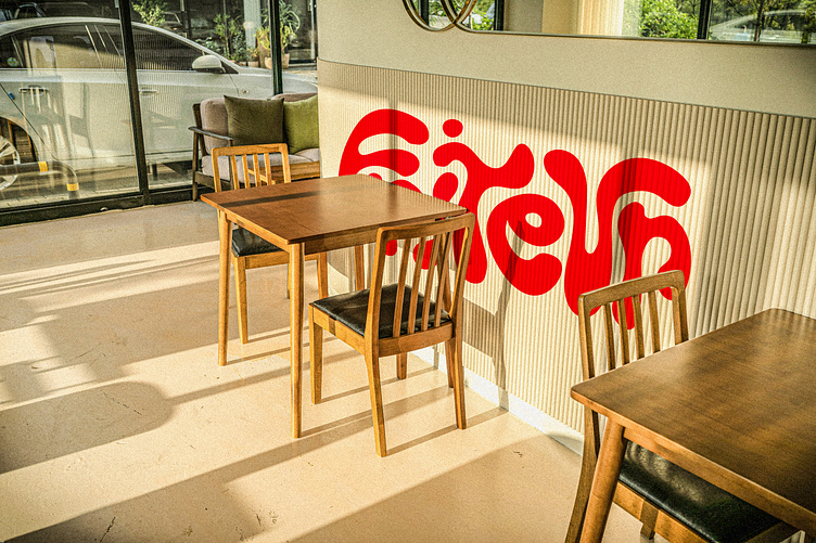
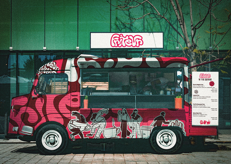
Friteur is a fun and funky fries company from Belgium, started by a group of passionate women. They wanted to do more than just sell fries—they wanted to create a happy place for customers and employees. Friteur is all about fresh, crispy, golden fries, combining traditional Belgian flavors with a modern, exciting twist. Inspired by Belgium’s famous street food culture, it is perfect for people who love tasty food on the go. This is not just a fries shop; it is a place full of energy, fun, and good vibes.
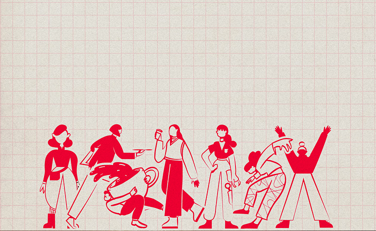
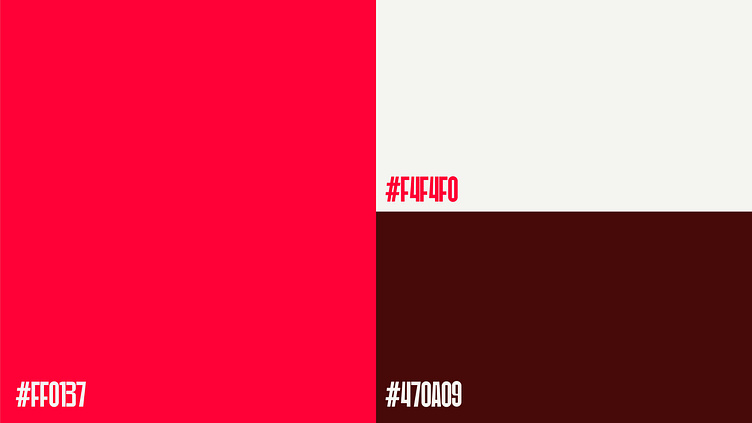
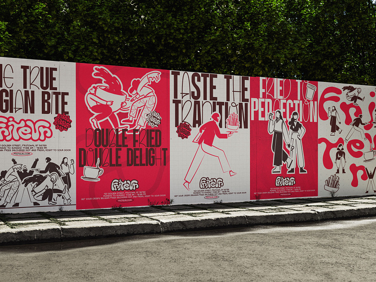
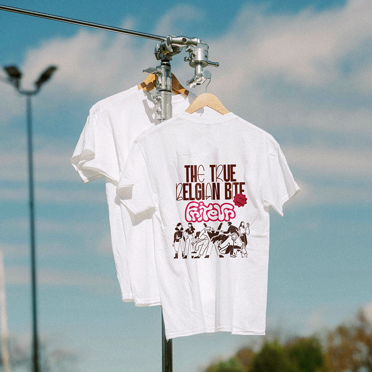
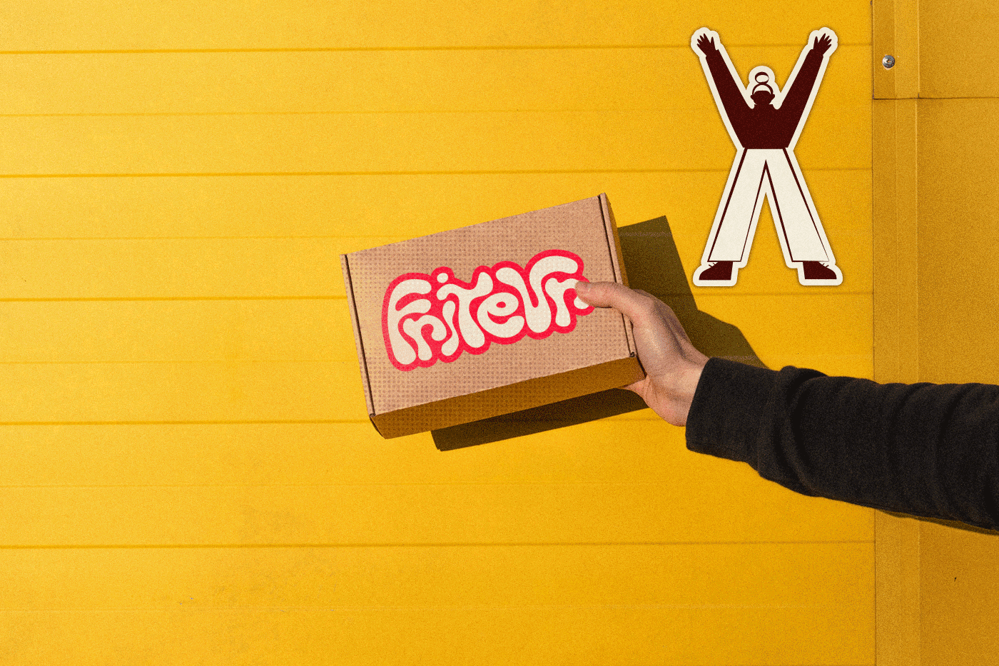
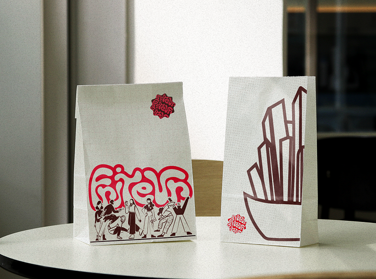
The brand look should be bold, colorful, and full of life, making it stand out from the crowd. The design will mix old-school and modern styles, with big, funky letters, fun drawings, and eye-catching colors. From cool packaging to fun social media posts, everything should be bright and exciting. When people see Friteur, they should feel happy and excited to eat delicious fries. It is a brand that is not too serious but always full of fun and creativity.
Friteur is not only about selling fries but also about taking care of its employees and making a positive impact. The company believes in giving good food, good service, and good energy to everyone. Whether someone loves classic fries or wants to try something new and funky, Friteur is the perfect place. It is a brand that brings people together with great taste, great design, and a great story.


BEHANCE
