Pause Life Magazine: A Case Study
Overview
The Pause magazine app is meant for young professionals and Millennials or Gen Z interested in minimalism as a lifestyle. The goal was to create an app that reflects this philosophy, using a simple and intuitive interface with effective searching and personally-curated content.
The Problem
Current magazine apps fail to meet the needs of young professionals and Millennials/Gen Z seeking a minimalist lifestyle.They have overwhelming content, complex interfaces, limited customization, and difficulty in finding relevant, trending, and reliable content. This disconnect leaves users feeling frustrated, unorganized, and unable to fully embrace minimalism.
User Research
Key Survey Results
Users’ reasons for using the app: To stay on trends, research, and entertain
Preferred tools: Basic app functionality (easy navigation, ready-to-read info, basic app preferences)
App features: Multimedia articles, one column grid, portrait-only orientation, bookmarking feature, personalized content recommendations
Users’ preferred ways of discovering new content: “For You” content, trending content, browsing followed topics
Features that make a more enjoyable experience:
- No biased information
- Effective search engine
- User-friendly navigation & interface
- Suggested content
- User library with bookmarked articles
Empathy Maps & Competitor Analysis
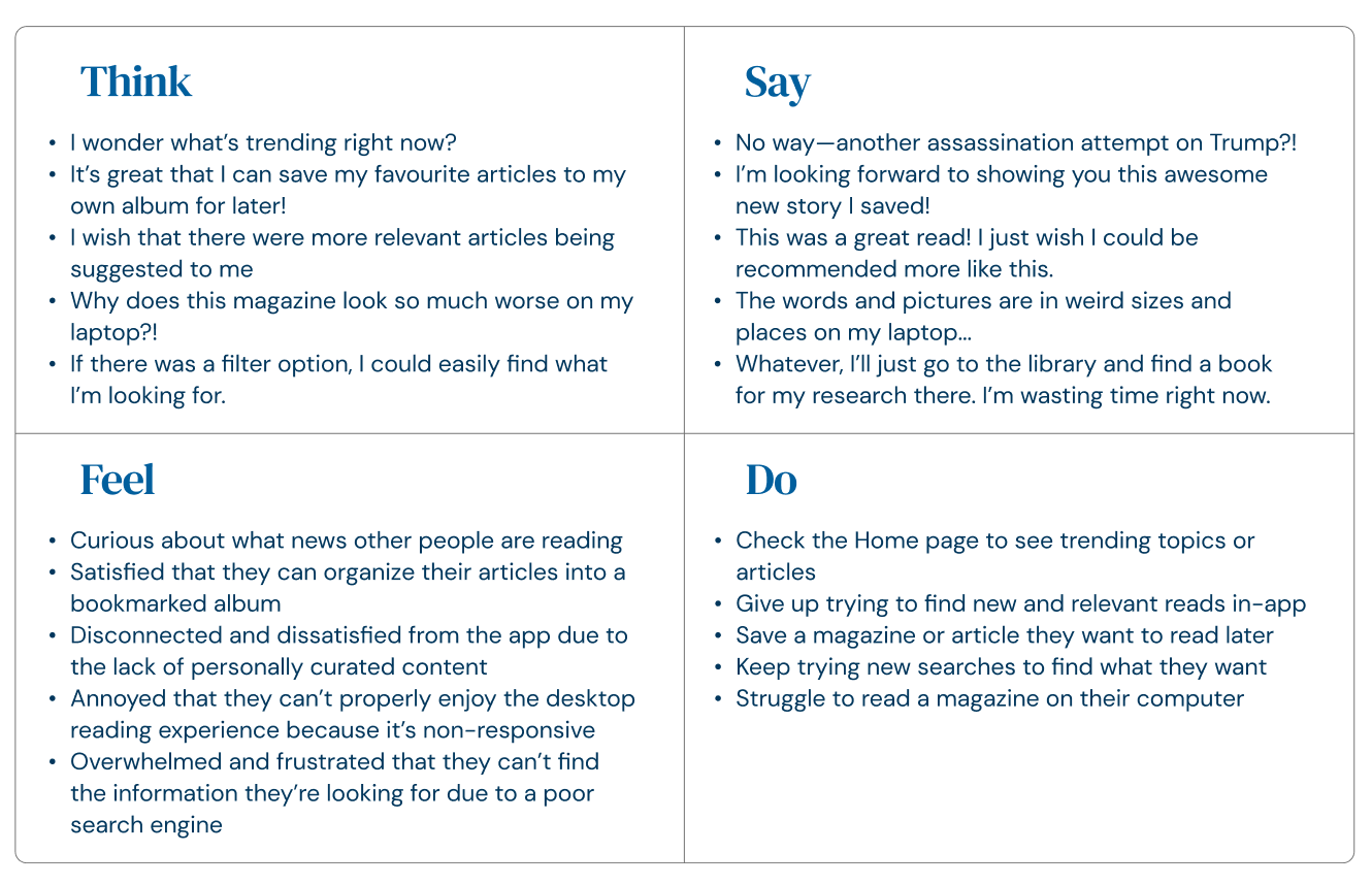
The next step was to examine the audience and determine their main needs or pain points.
Based on my research, I determined the following user needs, which are:
- Knowing “What’s trending?"
- Discovering relevant, personally-curated content
- Searching and filtering effectively
- Saving articles to a personal library
User Personas
With my survey results as a basis, I created three user personas to represent the app’s audience. These profiles ultimately helped me recognize must-have features, as well as user pain points.
User Flows
Focusing on subscriptions, searching, and bookmarking, I created user flows that allowed users to easily navigate back and forth between pages, choosing whether or not to subscribe, search, or bookmark. This helped me realize the need to prioritize a user-friendly interface for the audience, so that these actions are intuitive for users.
Wireframes
I created a series of lo-fi and hi-fi wireframes to represent the user flows I built. This really began to solidify the direction of the app, and was very effective in guiding the final design of the prototype.
Branding & Visual Design
About the Brand
The minimalist lifestyle magazine Pause reminds its audience to hit the “pause button” in their lives every once in a while for their well-being.
The logo uses a clean, weighted sans serif in lowercase letters to represent the approachable, mindful quality of the magazine’s content. The spacing and bullet points in between letters references the need to pause, take a breath, and stay on track. The logo font can be paired with a serif to add a level of refinement and professionalism. Its brand colours are soft, muted, and rich to represent the brand’s serene characteristics.
Visual Design
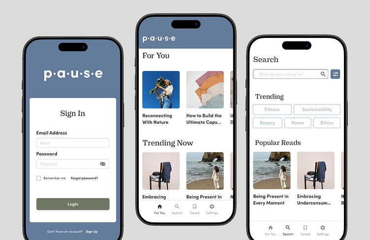
As a brand that believes in keeping things simple and enjoyable, I decided to use clean layouts and a soft, calm colour palette. The brand uses a refined serif for headers and sans serif for other components. The overall look is minimal, playful, and modern.
Component Library
Building a component library for Pause helped speed up the process of creating the final prototype. If I hadn’t created a library ahead of time, the app would’ve lacked consistency and functionality.
Sign-Up Process
This prototype demonstrates users signing up and choosing a subscription plan. Due to time restraints, I was unable to make further adjustments to the prototype. However, I would have made the password character requirement text larger for accessibility, changed the selected topics to a light colour with dark text to separate from the buttons, and adjust some alignments for consistency.
Sign In, Searching & Bookmarking
This prototype shows the sign in process and walks through the different pages of the app, including the For You, Article, Search, and Saved pages.Given more time, I would have built out the rest of the app, as this prototype only explores the features found in the user flows and wireframes. Adjustments I would have made would be allowing the user to confirm adding an article to a specific collection for increased ease-of-use, adjusted alignments for consistency, and explored a new “Search results” card layout for more visual interest.
User Testing & Iteration
There were minimal comments from users regarding the overall design and functionality of the prototype. Comments were positive, explaining that the navigation was intuitive and the design was clean. With more time, it would have benefited from having unique pages after clicking on a given article, rather than having the same placeholder article for each one. Likewise, having functioning navigation buttons along the bottom would make the experience more immersive.
Reflections & Lessons Learned
For me, this project was a deep dive into Figma’s software. I went from ground zero, beginning with FigJam for creating user flows and wireframes. I then learned how to create a design system and library within Figma, using this to build out my prototype. The prototype was a learning curve for me, but once I understood its basic functions I was able to create an interactive prototype. Now that I’ve learned the different elements of Figma, I would love to explore it more and play around with the interactive features. I also understand the need to stay organized and be patient, so that creating the prototype is easy and enjoyable.


