Website Design for Shiva Group
Design Description for the "Shiva Group"
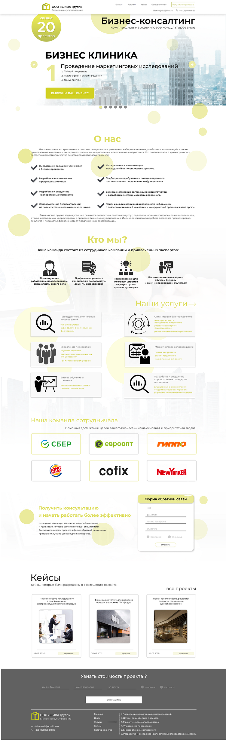
Fonts:
Main font: Montserrat. Used for all text on the site—headings, subheadings, and descriptions. The font style reflects a modern minimalist aesthetic and ensures excellent readability.
Color Palette:
- Primary color: Light lemon yellow (#F7EB65) — adds emphasis to key elements and creates a bright, positive impression.
- Secondary color: Pure white background (#FFFFFF) — ensures visual clarity and enhances readability.
- Accent color: Dark gray (#444444) for text and footer elements, reinforcing a sense of professionalism and seriousness.
- Black (#000000) is used for headings to create contrast and draw attention.
Design Techniques:
- Minimalism: A clean and structured layout that emphasizes key areas and information blocks.
- Text hierarchy: Well-organized structure for headings, subheadings, and body text to ensure easy navigation and comprehension.
- Grid system: Modular grid layout for symmetrical and balanced content placement.
- Icons: Visual markers for sections, making the information intuitive and easy to grasp.
Animations and Interactive Elements:
- Sliders: A slider on the homepage highlights the company’s services with smooth transitions.
- Hover effects: Buttons and images respond to hover actions, adding an interactive touch.
- Smooth scrolling: Seamless navigation through the site with soft scroll animations.
- CTA (Call-to-Action) buttons: Subtle animations, such as highlighting or color changes, to attract attention and encourage interaction.
