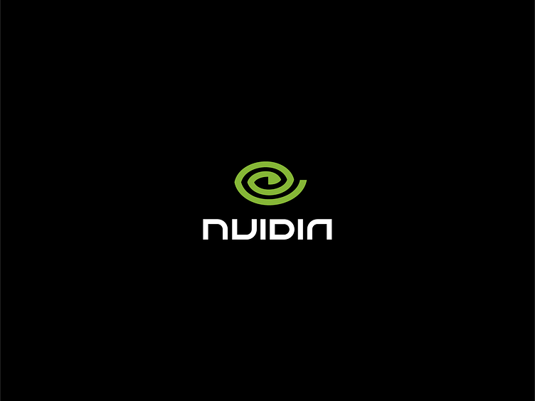
NVIDIA redesign concept
I've always felt that NVIDIA's logo has three logos creamed into one making the communication a few "visual" sentences too long. My goal was to bring more focus and clarity to it.
More by Dalibor Pajic View profile
Services by Dalibor Pajic
Like

