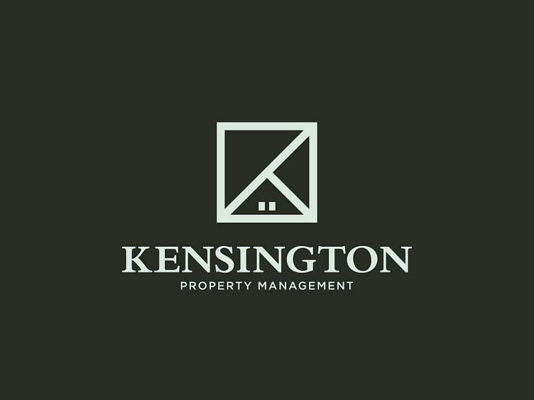
Kensington Property Management Logo Design
Kensington Property Management
The Kensington Property Management logo is a refined blend of modern minimalism and classic elegance. The central icon is a square that cleverly incorporates diagonal lines to form the letter "K," while subtle design elements, such as the small squares, represent windows and hint at a house hidden within the structure. This dual symbolism reflects the brand's focus on managing properties with sophistication and care. The serif font for "Kensington" exudes tradition and trustworthiness, while the smaller sans-serif font for "Property Management" adds a modern and approachable touch. Set against a muted dark green background, the color palette conveys stability, growth, and professionalism, perfectly aligning with the company’s mission to provide reliable and high-quality property management services.
