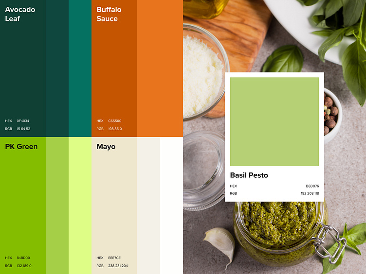
Primal Kitchen’s Refreshed Palette
Building on Primal Kitchen's legacy, we're excited to share the refreshed primary color palette for the site! These colors were carefully curated to honor their iconic packaging while embracing a clean, earthy aesthetic. Here's what you'll find:
Avocado Leaf & PK Green: Rich, vibrant greens inspired by their signature avocado oil and legacy green shades.
Buffalo Sauce: A bold pop of warmth, paying homage to their famous sauces.
Mayo: A soft, neutral base for a modern and clean look across the site.
This palette balances vibrancy and sophistication, perfectly aligning with Primal Kitchen’s mission of clean, flavorful eating.
Let us know your thoughts!
About Prismfly
Driving revenue for eCommerce brands through conversion rate optimization, full-stack development, branding, UI/UX design, and lifecycle marketing services.
learn more at www.prismfly.com
or reach us directly at contact@prismfly.com

