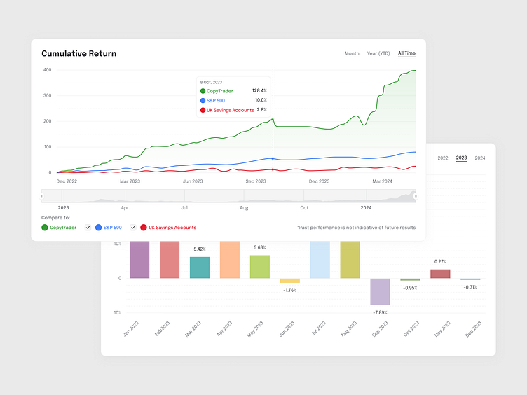
Data Analytics Charts
Designed UI components for complex financial data.
Monthly Gain: Features a visually engaging bar chart and data table, enabling users to effortlessly track percentage changes month by month.
Cumulative Return: Includes a comparative line graph that showcases portfolio performance against key benchmarks like the S&P 500 and UK savings accounts.
Thanks for checking it out!
Feel free to leave your feedback or reach out:
More by Alina Peicheva View profile
Like


