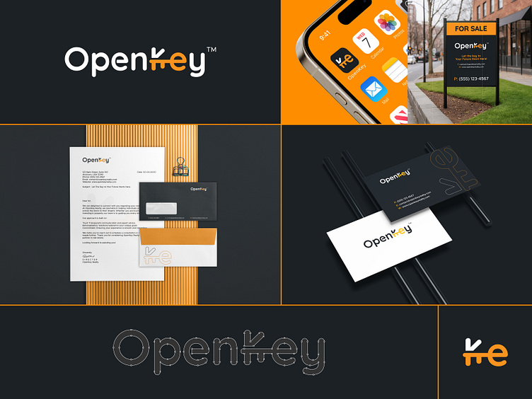
OpenKey - Branding Solutions and brand identity
The Story of OpenKey: Let the key to Your Future Start Here!
In the world of real estate, every transaction represents more than just property—it’s about people, their dreams, and the relationships that make those dreams a reality. The OpenKey logo captures this spirit with its unique design: the key nestled between the letters K and e is more than just a symbol of access—it represents the bridge between a client and a buyer.
The K and e embrace the key, symbolizing trust, connection, and partnership.
Every key tells a story:
1. A first home purchased by a young couple.
2. An investor unlocking the potential of a new property.
3. A family upgrading to a home where their memories will grow.
The key also signifies the trust clients place in OpenKey. It’s the physical and metaphorical tool that opens doors—not only to homes but also to opportunities, futures, and relationships. The Beer color of the key conveys warmth, optimism, and energy, while the modern, clean design reflects OpenKey’s professionalism and dedication to excellence. At OpenKey, we create seamless experiences, empowering buyers and clients. Whether buying, upgrading, or investing, OpenKey turns dreams into reality.
With every door unlocked, a new story begins. OpenKey is proud to be the key to those stories, helping people around the world build their futures, one relationship at a time.


