Welcome to my Biggby Redesign

Type: Redesign Application
Role: UX Researcher and Designer
Skills: Research, Visual Design
Background
Biggby Coffee is a local, midwest, franchisable family business. The existing coffee could bring more customers in by improving their in-app experience. Though the most ideal feature integration would be a community bulletin to highlight events hosted per location, the app itself is riddled with inefficiencies that frustrate its user base, which must be handled first. There is a decent foundation for the app and the quality of the company itself. Improvements like this could elevate the franchise further as it expands out beyond the Midwest.
Project Goal: The goal of this project is to redesign the Biggby coffee application to improve usability.
Research Objective: Understanding what grievances users currently have in the Biggby app.
Looking through the app store, I couldn’t help but notice how low Biggby’s rating is. Going through the reviews, it’s clear that the review section is skewed towards people rating the app a one star. Looking into the reviews, users complain about the app's inefficiencies and glitchiness. Many reviews even mention the improvements that the designers and developers can do.

Heuristic Evaluation

Design Changes
I decided to focus on the most impactful functionalities that would contribute to the user experience. The two main functionalities I decided to focus on when redesigning are the inconsistent widgets and the check out screen.

There are significant discrepancies between the different widgets for parameters that describe the same function, such as add/reduce ingredient, and choose amount from list. Aligning each action to the same widget type creates consistency that is intuitive for the user. I have altered the size buttons to be similar to the other editable items. This provides consistency and standardization across the different edits that can be made to the drinks, making it easier for the user to understand.
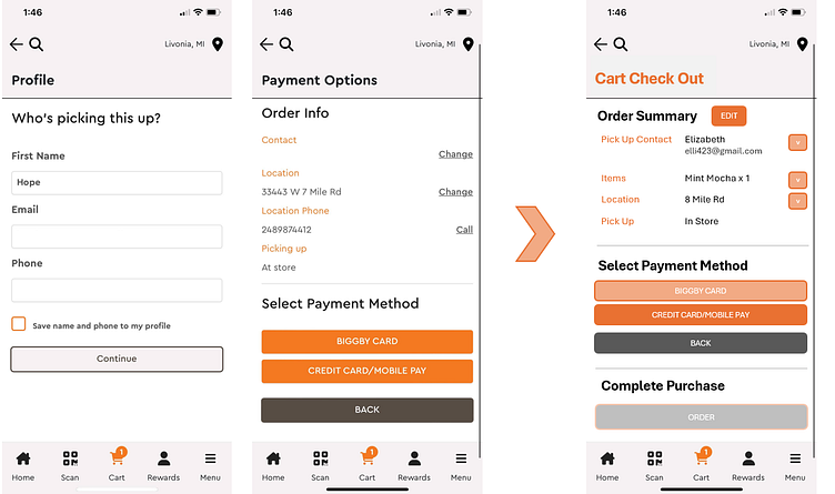
In this Cart Check Out screen, I have decided to combine these two screens into one screen. It shows the information of the pick up contact clearly rather than not including it in the payment option screen. Having all the information side by side provides clarity on labeling information. The dropdown button on the right provides the ability to look into or edit any of the components of the cart.
Future Scope
If I iterated further, I would have done a redesign on the process of ordering a coffee and conducted usability testing to understand how users respond to the new design. I’d iterate further until the ordering process is more intuitive and cohesive in the app.
Addendum
To improve usability on the Biggby app and to possibly bring more traffic to locations by including a community tab. The community aspect could include what people can do to give back or to get together at Biggby locations. Inspired by other small coffee shops, I would like to see if other family-owned franchises are able to do something similar on a larger scale. I would like to include events that Biggby hosts to foster a sense of community and to bring more traffic to their coffee shops. An example of such events could be poetry or book readings, or networking events. This can be done in conjunction with deals that they already run. I’d like for existing spaces like Biggby coffee to become third spaces for people to go, even without having to spend money.