Airmo logo
Hello everyone :)
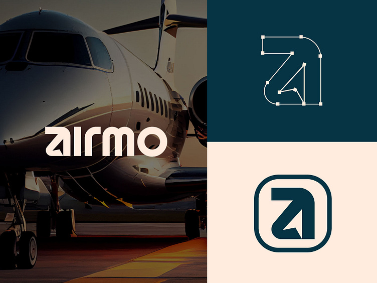
The Airmo logo is a sleek and modern design that conveys sophistication and motion, aligning perfectly with the aviation industry. The logo consists of the following elements:
Wordmark:
The name "Airmo" is designed in a custom, minimalist typeface with rounded edges, emphasizing modernity and approachability.
The letterforms are carefully crafted to be bold yet aerodynamic, suggesting speed, innovation, and reliability.
Monogram/Icon:
A stylized "A" is formed with clean geometric lines and curves, creating a dynamic upward arrow within the negative space. This symbolizes progress, ambition, and upward momentum, reflecting the aviation theme.
The icon is versatile and scalable, suitable for both digital and physical applications, from app icons to airplane branding.
Color Scheme:
The design utilizes a sophisticated dark teal and beige palette, evoking trust, elegance, and a sense of calm professionalism.
These colors complement the aviation industry's emphasis on safety and premium service.
for new project inquiries: arafatho7496@gmail.com
