Residential and Commercial Roofing Company Logo
Hidden Meaning Behind Homestead Roofing’s Fresh New Look.
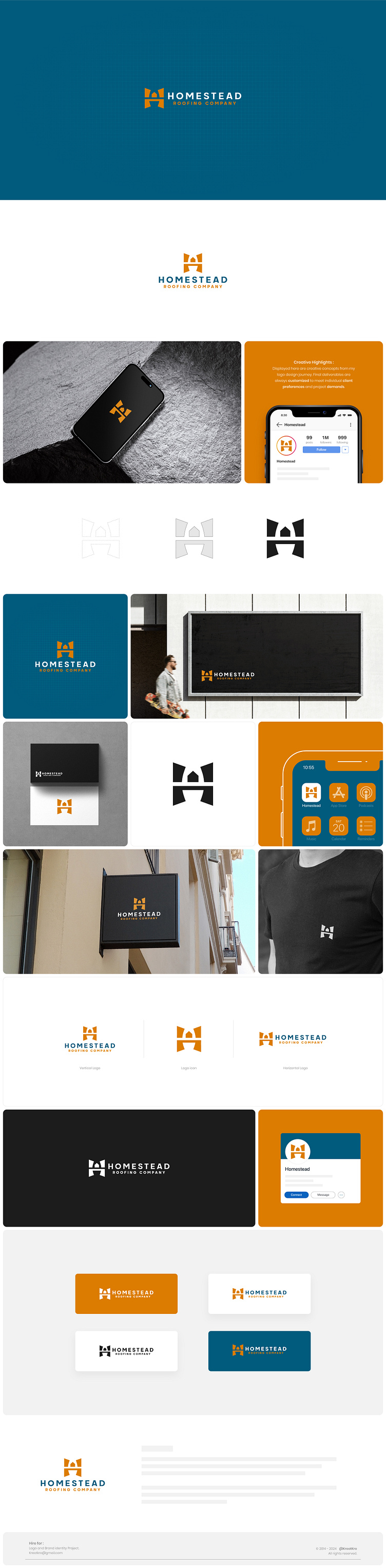
When Homestead Roofing Company approached me, they had a clear request: their old logo needed a fresh, modern look. As a company that sells and installs residential roofing, they wanted their branding to reflect the trust and reliability they’ve built over the years while appealing to today’s homeowners.
As a graphic designer specializing in branding and brand identity, I knew their new logo had to tell a story. I started with the letter “H” as the foundation of the design. To make it unique and meaningful, I placed a house symbol at the center of the “H,” representing their core business—roofing homes. This simple yet powerful graphic element instantly communicates what they do: protecting homes with quality roofs.
For the color palette, I chose #DC7D00 (a warm orange) and #005B7D (a deep teal blue). The orange adds energy and warmth, symbolizing trust and approachability, while the teal conveys calmness, professionalism, and stability—qualities homeowners look for in a roofing company.
When I unveiled the final design to the Homestead Roofing team, they were thrilled. One of them said, “This logo feels like us—modern, professional, and welcoming.” It was more than just a graphic; it became a symbol of their commitment to quality and care.
A great logo isn’t just about looking good; it’s about creating an emotional connection. For Homestead Roofing Company, this design now stands as a proud representation of their dedication to protecting homes and building lasting relationships with their clients.
Transform your brand into a powerful communication tool!
Let’s get started—contact us now!
@kreatkro | kreatkro@gmail.com
