The Perth Budgies Logo Suite
Go Perth Budgies! I’m excited to share with you a passion project of mine that I’ve thought about for years in the making. The Perth Budgerigars (or Budgies) are a women’s soccer team from Perth, Australia. After doing some research on the sports teams of Australia even though it’s not for a real team, I still want to solve a real problem I found that Australia is lacking in the soccer world, especially women’s soccer. They haven’t had any championships in a while. So I figured, perfect! I’ll make a team. Why Perth Australia? Because budgies (also known as parakeets) are native to West Australia, where Perth is the capital city. I always wanted to make a sports team where budgies are the mascot because they make the best pets! They have so much personality, are lifelong learners, and can have a variety of music tastes. I can’t believe there isn’t a budgie team yet!
I can’t wait to talk about this brand so here we go! I started with a mood board. Of course, I needed to have the perfect budgie image for my logo. I love this green guy because he has a great pose. I knew that if I got his silhouette, it would be the equivalent of “Guess that Pokémon” (well, for people who know budgies well). I also include a picture of Perth with one of their waters nearby) Perth is known for having super blue water and budgies are also surrounded by H2O so I knew that the color blue had to be included in the brand! The last image was chosen to symbolize teamwork because budgies travel in large flocks and they use their numbers against predators by flying away together.
For the font, I chose Bugar Sport (no, not because of the name) When I found it, I thought it was so perfect! I was looking for a thin font that looks different. A thin font was wanted because it reminds me of the budgies' small size. The sharp corners inside and out of this font create movement, which reminded me of the budgies’ speed. Now onto the colors! Green had to be the main one because Budgies are naturally green (fyi, any budgie you see in a different color is that way because of breeding) I chose this hue of green because it reminded me of the vivid colors in Perth. Everything seems to have a blueish tint there, have you noticed that from the picture above? I also chose two different blues: an almost white Alice Blue and a cute Powder Blue. Alice Blue is for the waters of Australia and Powder Blue is for a combination of professionalism and cuteness. Budgies are cute and friendly so I wanted to add that element there. (Dark blue is often the color for professionals like cops and mechanics so that’s what I meant.) You can’t have a sports logo without including the mascot, so I added pink for the bird’s feet.
The Perth Budgies Logo Suite
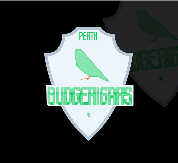
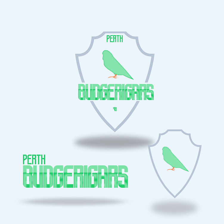
Now, we're onto the logos! I definitely want to create an emblem logo, 1 because most soccer logos are and 2 because they make you look like you've been around for a while. You're high-class, trustworthy, and confident. Perth Australia is not a cheap place! I wanted to give this brand a polished look so that it fits with the location. For the body of the logo, I wanted to create a shield. The top of the shield is narrow so that the city, "Perth", in green will fit perfectly inside. The shield loops into two sharp corners, then wider corners, and is finally brought down to a point at the bottom. The loops represent waves. I made the bottom loops bigger and wider than the ones at the top because I wanted to create a unique shape. Plus, shields do get wider at the sides so it only made sense. I made the shield light blue since it's close to white and that would give it that high-class feel. The outline of the shield is in Powder Blue because I wanted to keep the blues together continuing with the water theme. In the middle is a silhouette of a bird in the middle. I only added a green body and pink feet for a less is more approach. I tried adding more detail such as a beak and wing but it took away from the rest of the logo. So I figured to stay simple instead of doing a contrast. Under the bird is "Budgerigars" in big green letters since that is the primary color. I also added a water-like texture to it, continuing with the water theme. Only the bottom half is texturified (I know that's not a real word, you gotta get to know me more! lol) to mimic the separation of land and sea. I also added a pale blue background for the word. Now that everything was done, I felt there was something missing. I took inspiration from a design tutorial to use the initials of the Perth Budgerigars but I flipped the "P" so the letters' backs are facing each other, and then I combined them. I made them really small in green and put them under "Budgerigars". And just like that the main logo is done!
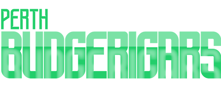
For the secondary logo (the logo used for smaller spaces, typically horizontal, like a business card), I removed the visuals and put the words closer together. Perth is placed on the top left side. I didn't want to put it in the middle because that would be too predictable. It felt organized that way since we read from left to right.
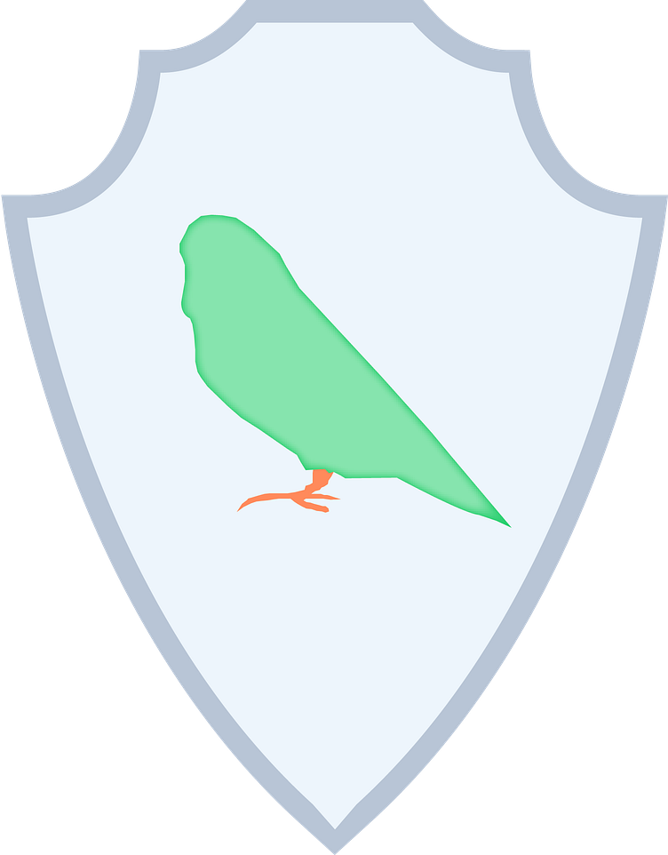
For the submark logo (the logo used for even smaller space, like a YouTube icon on the bottom right side of a video), I only kept the shield and bird.
