Logo Design No. 2: Monogram Dribbble Avatar
Heads-Up! A sub-project related to my monogram will be out soon so keep your eyes peeled :D
Hey, Peeps!
I have finally made myself a monogram logo for the Dribbble avatar to make my profile extra legit so I can apply for the Designer Account (fingers crossed!)
The Brief:
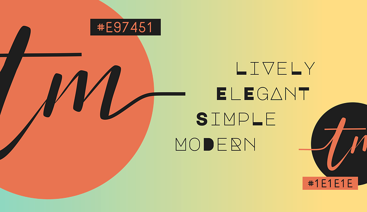
1] User Name: T Mukherjee
2] What does She do?: Designing UI/UX, favicons, and some logo work (Learning in Progress)
3] Feeling: Simple, elegant, adaptive and creative, friendly and approachable
4] Preferences: Monogram of initials 'TM' using black and orange, should be round, and the file size should be less than 800KB.
The Process:
As usual, I went right away to sketching after listing out what I want and picking suitable colours to convey the right message to the crowd, and most importantly, represent me.
After some trial and error, and a bit of assistance from my siblling, the perfect monogram logo design was born.
Colours
1] Burnt Sienna/#E97451: Earthy orange for a fun and down-to-earth feel
2] Nero/#1E1E1E: Cool matte black for elegance
3] Honeydew/#F1FAEE: Mellow white for the canvas before adding the content
4] Mint + Sunglow/#61C9A8 + #FFD151: Fresh and friendly colours mellowed out by bringing the opacity down to 70% + the colour honeydew helped better than the default white canvas
Typeface
I did try out some typefaces but it wasn't giving 'me' enough, hence I experimented with freehand sketching so any flourishes or embellishments could be added easily. This was my first foray into hand-lettering and is something I would like to further study!
What I love is the extending lines from the 't' and 'm' that give the monogram an overall simple yet elegant look with some added excitement when it leaves the circle. Plus, the initials are italicised to give a forward-thinking attitude, as I tend to think more about the long-term, not just the present.
As for the typefaces used in the:
1] Hexcode Labels: Nova Mono (1001freefonts) for the clean and modern look
2] Adjectives: Major Mono Display (Google Fonts) for the playful modern look with added geometry
I found that both of these typefaces worked well with the overall theme, and also suited my personality.
Overall, this poster about my monogram pretty much represents my personality- Modern, elegant, clean, approachable, fun and experimental in a way, and a thinker.
Software
Inkscape all the way! + Tutorial on swashes (LogosByNick from YouTube) may seem irrelevant but was super handy for imitating the brushpen strokes from the rough sketch perfectly, and I'm quite happy with the result :D
Note: The typefaces used are Free for Commercial Use.
