Scaling Font For a Hymn App
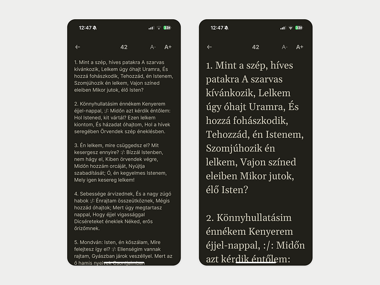
For this hymn app, I made the text size adjustable, with the app remembering each user's preference. Interestingly, we found this feature helps everyone, not just older people: since people often put their phones on the bench while standing, larger text is generally better for all users.
On the larger scales, the apps also switches to a serif font for even better legibility.
Note: this isn't a fancy UI. Lots of the time, having the right focus and simplicity wins.
More by István Jakab View profile
Like
