Sprocket iOS Viewing UIX 2024
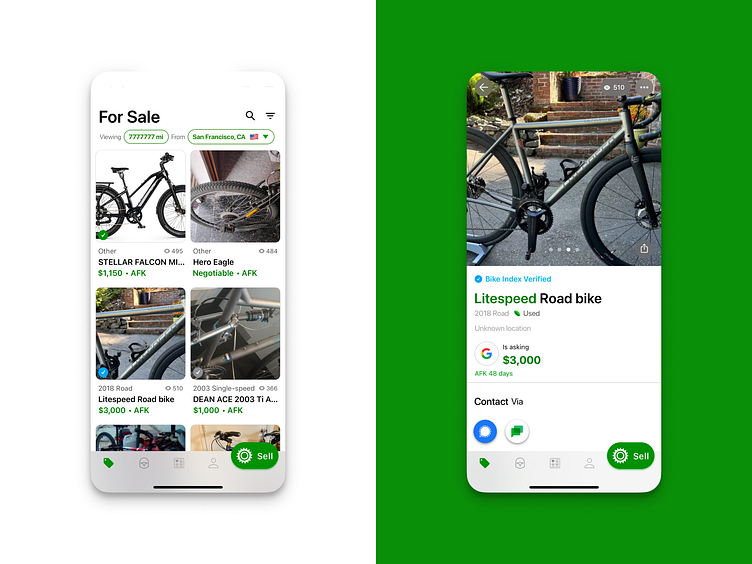
Current Sprocket UX on iPhone for 2024. Notable is is the inclusion of the FAB in the navigation bar which we had to hack in there by repositioning all the other icons within their 4/5 slots. The big image tile UI was actually A/B tested on the Play Store screenshots before being built into the app. On the detail screen the share button has been moved down to be more ergonomically accessible on taller phones. Most critically the contact buttons went through several major UX revisions as the number of possible methods expanded, in order to be both scalable to fit all of them by sidescrolling and intuitive to use. Note: these are actual screenshots not Figma mockups
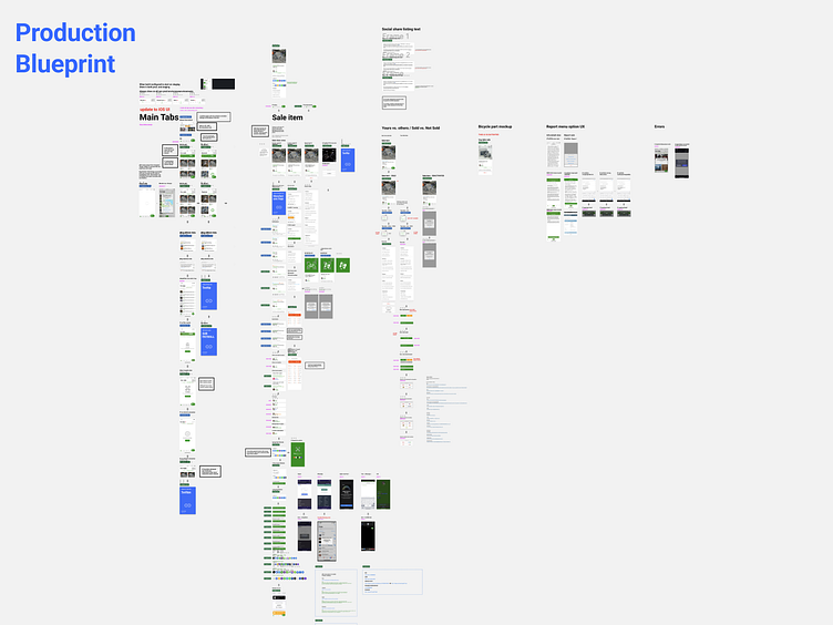
Hi-Fi production blueprints for both of these two areas in the app documenting whats implemented irl

